CnVersionInfoCard
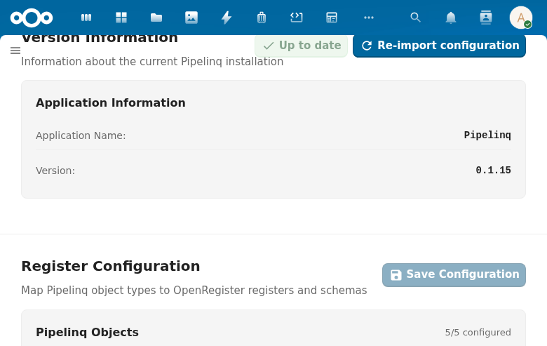
Displays application version information in admin settings pages. Shows the app name, installed version, optional configured version, and an update status indicator with an optional update button.
Try it
Props
| Prop | Type | Default | Description |
|---|---|---|---|
appName | String | (required) | Application name displayed in the version row |
appVersion | String | (required) | Installed application version string |
title | String | 'Version information' | Section title |
description | String | 'Information about the current application installation' | Section description |
docUrl | String | '' | Documentation URL — shows an info icon link next to the title |
wide | Boolean | true | Under the board look the card spans the whole settings grid, as the boards draw it. false keeps it one card in the grid. No effect without the board look. |
cardTitle | String | 'Application information' | Heading shown inside the card |
configuredVersion | String | '' | Configured version string (for apps that track configuration versions separately). When non-empty, an extra row is shown; the board look always shows the row, reading "Unknown" until the app passes a value, with ", up to date" after it when inlineUpToDate and showUpdateButton are on and isUpToDate holds. |
showAppName | Boolean | true | Board look: draw the "Application name" row. The default look always draws it. |
actionsDivider | Boolean | true | Board look: draw a rule between the facts and the buttons. |
compact | Boolean | false | Board look: dossiq's compact card in one switch: no "Application name" row, no rule above the buttons, the up-to-date state inline and 15px facts. The default keeps PqBeheer's card. Its labels carry no colon ("Version 0.4.47"). |
inlineUpToDate | Boolean | false | Board look: read the up-to-date state in the configured version row instead of a disabled "Up to date" button (dossiq's boards pass true). |
isUpToDate | Boolean | true | Whether the configured version matches the installed version. Controls the status indicator color. |
showUpdateButton | Boolean | false | Whether to show an "Update" action button |
updating | Boolean | false | Whether an update is currently in progress (shows a loading indicator on the button) |
additionalItems | Array | [] | Extra key-value items: [{ label, value, statusClass? }] |
loading | Boolean | false | Loading state |
labels | Object | {} | Override the standard row labels (appName, version, configuredVersion). A label left out keeps the translated default ("Application name", "Version", "Configured version"; in Dutch "Naam van de app", "Versie", "Ingestelde versie"). |
Events
| Event | Payload | Description |
|---|---|---|
update | — | Emitted when the Update button is clicked |
Slots
| Slot | Description |
|---|---|
#actions | Extra action buttons in the card header |
#additional-items | Custom additional items (replaces additionalItems prop rendering) |
#footer | Footer content below the card |
#extra-cards | Additional cards rendered after the version info card |
Usage
<CnVersionInfoCard
  app-name="OpenRegister"
  app-version="1.5.0"
  configured-version="1.4.0"
  :is-up-to-date="false"
  :show-update-button="true"
  :updating="updating"
  @update="runUpdate" />
Reference (auto-generated)
The tables below are generated from the SFC source via vue-docgen-cli. They reflect what's actually in CnVersionInfoCard.vue and update automatically whenever the component changes.
OpenRegister reliance
none: this component does not touch OpenRegister, directly or through anything it imports. 0 direct references, 0 files reached through imports.
See the reliance overview for the filterable list.
Props
| Name | Type | Required | Default | Description |
|---|---|---|---|---|
look | string | '' | The look the card is drawn in: board or nextcloud. Empty follows the cnLook that CnAppRoot provides. Under board the facts are a two-column list and the actions sit in a footer row. | |
wide | boolean | true | Under the board look the card spans the whole settings grid, as the boards draw the version card. Set to false to keep it one card in the grid. Without the board look it has no effect. | |
title | string | () => t('nextcloud-vue', 'Version information') | Section title | |
description | string | () => t('nextcloud-vue', 'Information about the current application installation') | Section description | |
docUrl | string | '' | Documentation URL (shows info icon next to title) | |
cardTitle | string | () => t('nextcloud-vue', 'Application information') | Card heading text | |
appName | string | ✓ | — | Application name to display |
appVersion | string | ✓ | — | Application version string |
configuredVersion | string | '' | Configured version (optional, for apps that track configuration versions separately) | |
showAppName | boolean | true | Board look: draw the "Application name" row (PqBeheer does, dossiq's boards name the app in the description instead). | |
actionsDivider | boolean | true | Board look: draw a rule between the facts and the buttons (PqBeheer does, dossiq's boards do not). | |
inlineUpToDate | boolean | false | Board look: read the up-to-date state in the configured version row ("0.4.47, bijgewerkt", dossiq's boards) instead of a disabled "Up to date" button among the buttons (PqBeheer). The update button still shows while an update is due. | |
compact | boolean | false | Board look: the compact card of dossiq's boards in one switch: no application name row, no rule above the buttons, the up-to-date state inline, and 15px facts. The default keeps PqBeheer's card. | |
isUpToDate | boolean | true | Whether the app configuration is up to date | |
showUpdateButton | boolean | false | Whether to show the update button | |
updating | boolean | false | Whether an update is currently in progress | |
additionalItems | array | [] | Additional key-value items to display. Format: [{ label: 'Label', value: 'Value', statusClass: 'cn-version-info__status--ok' }] | |
loading | boolean | false | Whether version info is loading | |
labels | object | \{\} | Custom labels for the standard fields, { appName?, version?, configuredVersion? }. A label left out keeps the translated default. |
Events
| Name | Payload | Description |
|---|---|---|
update | — |
Slots
| Name | Bindings | Description |
|---|---|---|
actions | — | |
additional-items | — | |
footer | — | |
extra-cards | — |
Board look
Under the board look (look prop or cnLook) the facts are a two-column list and the state button and the actions (re-import) move into a footer row after a hairline. The support footer follows the row.
Compact board card
With compact (boards DqBeheerinstellingen, DqInstellingenAlgemeen) the board card has no "Application name" row (the description names the app), no rule above the buttons, the up-to-date state inline in the configured version row ("0.4.47, bijgewerkt") instead of a disabled button, and 15px facts; the update button shows only while an update is due. showAppName, actionsDivider and inlineUpToDate switch the first three one by one. Inside CnAdminSettingsShell with compact the support lines become one "Support" row, re-import is a secondary button, and the description reads "About this {app} installation." Without these props the board card is PqBeheer's, as before. Its labels carry no colon; the full board card (PqBeheer) and the Nextcloud look keep "Version:".