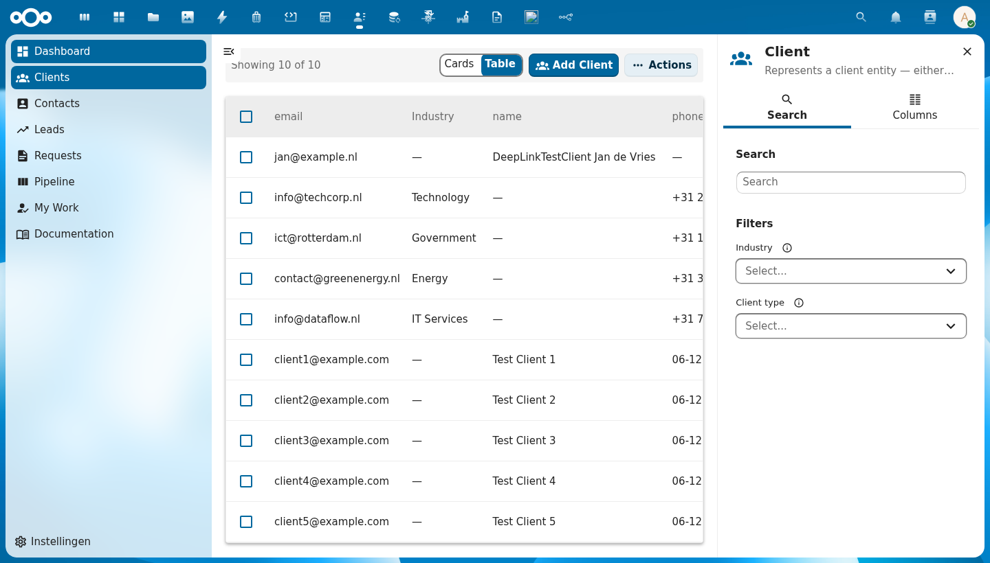
CnIndexPage
The main list page component. Combines a data table (or card grid), filter bar, pagination, mass actions, CRUD dialogs, and a right-click context menu into a single schema-driven page.
Wraps: NcEmptyContent, NcLoadingIcon (from @nextcloud/vue), CnContextMenu
Try it
Props
| Prop | Type | Default | Description |
|---|---|---|---|
title | String | (required) | Page title |
description | String | '' | Optional subtitle |
showTitle | Boolean | false | Show the page header (icon, title, description) inline above the table. When false (default), the title is shown in the sidebar header instead. |
icon | String | '' | MDI icon name for the page header. Defaults to schema.icon when a schema is provided. |
schema | Object | String | null | OpenRegister schema for auto-generating columns, filters, and form fields. In self-fetch mode a String is the schema slug — the resolved schema object then drives column generation. |
objects | Array | [] | Row data. Omitting this prop while register + schema are set switches the page into self-fetch mode — it drives the list off the object store itself. |
filter | Object | null | Self-fetch mode only — a base filter map applied to every fetch as a fixed filter (the user's facet filters can't override it). String values of the form "@route.<name>" or ":<name>" resolve to $route.params[<name>]; other values pass through. Re-resolves when $route.params change. Fed from pages[].config.filter in the manifest path. No effect in consumer-managed mode. |
quickFilters | Array | null | Self-fetch mode only — array of \{ label, filter, default?, icon? \} rendered as a tab strip above the table (see CnQuickFilterBar). The active tab's filter is merged into every fetch after filter (the tab wins on a colliding key) and before the user's activeFilters (which still narrow within the active tab). String values follow the same "@route.<name>" resolution as filter. First entry with default:true (else index 0) is active on mount; switching tabs re-fetches at page 1 and emits @quick-filter-change. Fed from pages[].config.quickFilters. |
quickFilterMode | String | 'chips' | How the quick filters render: 'chips' (pill strip) or 'dropdown' (a single NcSelect; the empty-filter "All" tab is dropped). Fed from pages[].config.quickFilterMode. |
quickFilterMultiple | Boolean | false | Allow several quick filters active at once. Selected tabs' filters are OR-ed together into the fetch (same field → array value → field[]= IN query). Fed from pages[].config.quickFilterMultiple. |
pagination | Object | null | Pagination state (\{ currentPage, totalPages, totalItems, pageSize \}) |
loading | Boolean | false | Loading state |
loadingText | String | 'Loading…' | Accessible label for the loading spinner (NcLoadingIcon aria-label) |
selectable | Boolean | true | Enable row selection checkboxes |
rowClickToView | Boolean | false | When true, a row/card click emits row-click (to open/navigate) even while selectable — selection then via the checkbox only. Manifest-driven pages set this automatically when a matching detail page exists. |
selectedIds | Array | [] | Currently selected IDs |
viewMode | String | 'table' | 'table' or 'cards' |
sortKey | String | null | Current sort column key. null means no column is actively sorted. |
sortOrder | String | 'asc' | 'asc', 'desc', or null (no sort) |
defaultSort | Array | [] | Default multi-key client-side sort applied to the already-loaded rows whenever no explicit column sort is active (no sortKey). Each entry is \{ field, order? \} with order one of 'asc' / 'desc' (default 'asc'); rows compare by the first field, ties broken by the next, etc. (type-aware: numbers numerically, dates by timestamp, else localeCompare; empties sort last). Clicking a sortable header takes over and suppresses this default. Fed from pages[].config.defaultSort. Useful for a fixed presentation order such as group-by-type-then-name. |
rowKey | String | 'id' | Unique row identifier field |
rowIcon | String | Function | null | Optional leading icon for every table row — a static MDI icon name or (row) => iconName. Forwarded to CnDataTable. Fed from the manifest as pages[].config.rowIcon. |
activeOrganisation | Object | null | null | Optional multi-tenant binding from a tenant-switcher higher in the tree. When the bound organisation changes, CnIndexPage calls store.setActiveTenantOrganisation(uuid) so the next fetchCollection() stamps the new X-OpenRegister-Organisation header and the in-memory list caches are cleared. Leave null for single-tenant pages. See Multi-tenancy guide. |
columns | Array | [] | Manual column definitions (overrides schema) |
excludeColumns | Array | [] | Schema columns to hide |
includeColumns | Array | null | Schema columns to show (whitelist) |
columnOverrides | Object | \{\} | Per-column overrides |
actions | Array | [] | Custom row action definitions. Each entry accepts the runtime {label, icon, handler, …} shape (function-typed handler fires directly) AND the manifest shape with a string handler resolved through customComponents — see "Action handlers" below. |
customComponents | Object | null | Custom-component / handler registry. When set takes precedence over the injected cnCustomComponents from a CnAppRoot ancestor. Used to resolve actions[].handler registry names (manifest-actions-dispatch). |
emptyText | String | 'No items found' | Empty state message |
rowClass | Function | null | CSS class provider for rows |
addLabel | String | '' | Add button label |
inlineActionCount | Number | 2 | Number of inline action buttons before overflow menu |
showMassImport | Boolean | true | Show mass import action |
showMassExport | Boolean | true | Show mass export action |
showMassCopy | Boolean | true | Show mass copy action |
showMassDelete | Boolean | true | Show mass delete action |
massActionNameField | String | 'title' | Field for display names in mass action dialogs |
nameFormatter | Function | null | Optional function (item) => string to format item names in dialogs. Overrides massActionNameField when provided. Passed to all delete and copy dialogs. |
exportFormats | Array | [] | Available export formats |
importOptions | Array | [] | Import dialog options |
showFormDialog | Boolean | true | Enable built-in create/edit form dialog |
showRequestFeature | Boolean | true | Show the built-in "Request a feature" entry in the CnActionsBar overflow. Opens the CnSuggestFeatureModal with surface: "index:<schema>". Requires a CnAppRoot ancestor (repo inject) to open — warns + no-ops otherwise |
useAdvancedFormDialog | Boolean | false | Use CnAdvancedFormDialog for create/edit (properties table, JSON tab, optional metadata) instead of CnFormDialog |
createOverride | Function | null | Opt-in async create hook. When set, a create confirmed from the built-in form dialog calls await createOverride(formData, ctx) instead of the store / self-store saveObject. The override owns persistence (e.g. an app posting through a contact-aware endpoint that fills a required FK before saving to OpenRegister) and must return the created object on success (falsy = failure; throwing surfaces the error in the dialog). ctx is { register, schema, objectType, effectiveSchema }. Edits are never routed here; when absent, create behaviour is unchanged. See Per-schema create-override hook. |
showViewAction | Boolean | true | Show the built-in View row action. Emits a dedicated @view event — independent of @row-click. Set to false when the row has no separate "open detail" target. |
showEditAction | Boolean | true | Show edit row action |
showCopyAction | Boolean | true | Show copy row action |
showDeleteAction | Boolean | true | Show delete row action |
excludeFields | Array | [] | Form fields to hide |
includeFields | Array | null | Form fields to show (whitelist) |
fieldOverrides | Object | \{\} | Per-field overrides |
showAdd | Boolean | true | Show the Add button in the actions bar |
addDisabled | Boolean | false | Disable the Add button (e.g. when required selections are missing) |
refreshDisabled | Boolean | false | Disable the refresh button (e.g. when required selections are missing) |
showViewToggle | Boolean | true | Show table/card view toggle |
inlineSearch | Boolean | false | Show an inline search field in the actions bar (manifest: config.inlineSearch) |
filterMenu | Boolean | false | Show a filter menu (funnel) in the table header listing each enum/badge column's values as toggleable facet filters (manifest: config.filterMenu) |
columnMenu | Boolean | false | Show a column menu (columns button) in the table header listing every governed column as a visibility checkbox — the in-table equivalent of the sidebar's Columns tab (manifest: config.columnMenu). See Filter and columns: table header vs sidebar. |
searchPlaceholder | String | '' | Placeholder for the inline search field (manifest: config.searchPlaceholder) |
cardsLabel / tableLabel | String | '' | View-toggle option labels, e.g. "Tiles" / "List" (manifest: config.cardsLabel / config.tableLabel) |
cardsIcon / tableIcon | String | '' | MDI icon names for the view-toggle options (manifest: config.cardsIcon / config.tableIcon) |
store | Object | null | Store instance for automatic save integration. When provided with objectType, the form dialog saves directly to the store via store.saveObject() instead of only emitting create/edit. The object type must already be registered in the store via registerObjectType(). |
objectType | String | '' | Object type slug for store integration (e.g. \${registerId}-\${schemaId}). Required when store is set — a console warning is emitted if missing. |
sidebar | Object | null | Manifest-driven sidebar configuration. When set with enabled: true, CnIndexPage auto-mounts an embedded CnIndexSidebar and forwards its props. Shape: \{ enabled, show?, columnGroups?, facets?, showMetadata?, search? \}. show (default true) is the visibility gate — set false to hide the configured sidebar without removing config. When unset (the default), the legacy slot-based pattern is preserved — consumers wire their own CnIndexSidebar at the App.vue level. See Manifest-driven sidebar below. |
searchValue | String | '' | Current search term forwarded to the embedded sidebar (only relevant when sidebar.enabled). |
visibleColumns | Array | null | Currently visible column keys forwarded to the embedded sidebar (only relevant when sidebar.enabled). |
activeFilters | Object | \{\} | Currently active facet filters \{ fieldName: [values] \} forwarded to the embedded sidebar (only relevant when sidebar.enabled). |
register | String | '' | Effective register slug for the page. Forwarded as a prop to the resolved cardComponent so bespoke card UIs can match the schema → register pair. Manifest-driven path: pages[].config.register flows in via CnPageRenderer. |
cardComponent | String | '' | Optional name of a consumer-provided card component (registered in the customComponents registry on CnAppRoot) to render in place of the default CnObjectCard when the page is in card-grid view mode. Resolution priority: #card scoped slot → cardComponent registry entry → default CnObjectCard. Unknown names log a console.warn once and fall back to the default so a misconfigured manifest never blanks the grid. See Bespoke card-grid below. |
customComponents | Object | null | Optional explicit customComponents registry. Overrides the registry injected from CnAppRoot via cnCustomComponents. Mostly used by unit tests; production consumers register components on CnAppRoot instead. |
Events
| Event | Payload | Description |
|---|---|---|
add | — | Add button clicked (backward compat) |
create | formData | Form dialog create confirmed. When store integration is active, payload is the saved object returned by the store. |
edit | formData | Form dialog edit confirmed. When store integration is active, payload is the saved object returned by the store. |
delete | id | Single delete confirmed |
copy | \{ id, newName \} | Single copy confirmed |
mass-delete | ids[] | Mass delete confirmed |
mass-copy | \{ ids, pattern \} | Mass copy confirmed |
mass-export | \{ ids, format \} | Mass export confirmed |
mass-import | importData | Mass import confirmed |
refresh | — | Refresh button clicked |
row-click | row | Row or card clicked. Only fires when selectable is false — when selectable is true, a deliberate click anywhere on a row/card toggles its selection (emitting select) instead — a text-selection drag is not treated as a click. Conceptually distinct from view; for click-to-open in a selectable list, use the built-in View action (@view). |
view | row | Built-in View row action triggered. Conceptually "open the detail view of this row". For a non-selectable list bind alongside row-click (same handler) for click-to-view; for a selectable list, plain clicks toggle selection, so use @view (the eye action) as the open-detail affordance. |
sort | \{ key, order \} | Sort changed. Cycles through asc → desc → null (disabled). When cleared, both key and order are null. |
page-changed | pageNum | Pagination page changed |
page-size-changed | size | Page size changed |
select | ids[] | Selection changed |
action | \{ action, row \} | Custom row action triggered |
search | term | Search input changed in the embedded sidebar (only emitted when sidebar.enabled). |
columns-change | keys[] | Visible columns changed in the embedded sidebar (only emitted when sidebar.enabled). |
filter-change | \{ key, values \} | Facet filter changed in the embedded sidebar (only emitted when sidebar.enabled). |
quick-filter-change | index | Zero-based active tab index changed (only emitted when quickFilters is set). The fetch is automatically triggered — listen for observability / analytics. |
Slots
| Slot | Scope | Description |
|---|---|---|
#below-header | — | Content rendered between the page header and the actions bar (e.g. status banners, alerts) |
#mass-actions | \{ count, selectedIds \} | Extra mass action buttons |
#action-items | — | Extra action bar buttons |
#header-actions | — | Extra header buttons |
#delete-dialog | \{ item, close \} | Replace single-item delete dialog |
#copy-dialog | \{ item, close \} | Replace single-item copy dialog |
#form-dialog | \{ show, item, schema, close \} | Replace create/edit dialog (any variant). Use show as a v-if guard so the dialog unmounts after close; otherwise an always-mounted override re-opens when its internal close animation finishes. |
#form-fields | \{ fields, formData, errors, updateField \} | Form content override (CnFormDialog only; ignored when useAdvancedFormDialog is true) |
#field-\{key\}-option | option object properties | Custom dropdown option rendering for a select field (forwarded to NcSelect #option) |
#field-\{key\}-selected-option | option object properties | Custom selected option display for a select field (forwarded to NcSelect #selected-option) |
#import-fields | \{ file \} | Extra import dialog fields |
#empty | — | Custom empty state |
#card | \{ object, selected \} | Custom card template (cards view) |
#row-actions | \{ row \} | Custom row actions |
#column-\{key\} | \{ row, value \} | Custom cell renderer per column |
Public Methods
| Method | Description |
|---|---|
setFormResult(result) | Set the terminal form dialog result (\{ success?, error? \}) — switches to the result phase, replacing the form |
setFormValidationErrors(fieldErrors, message?) | Show a validation error while keeping the form visible (so the user can fix the data). Use for 400/422; store integration calls this automatically for isValidation errors |
setSingleDeleteResult(result) | Set delete dialog result |
setSingleCopyResult(result) | Set copy dialog result |
setMassDeleteResult(result) | Set mass delete result |
setMassCopyResult(result) | Set mass copy result |
setExportResult(result) | Set export dialog result |
setImportResult(result) | Set import dialog result |
openFormDialog(item) | Programmatically open form (null = create) |
Usage
<template>
  <CnIndexPage
    :title="schema?.title || 'Contacts'"
    :schema="schema"
    :objects="objects"
    :pagination="pagination"
    :loading="loading"
    @row-click="onRowClick"
    @create="onCreate"
    @edit="onEdit"
    @delete="onDelete"
    @refresh="onRefresh"
    @page-changed="onPageChanged"
    @sort="onSort">
    <!-- Custom status column rendering -->
    <template #column-status="{ row, value }">
      <CnStatusBadge :label="value" :colorMap="statusColors" />
    </template>
  </CnIndexPage>
</template>
Using the advanced form dialog
Set use-advanced-form-dialog to use CnAdvancedFormDialog for Add/Edit (properties table, JSON tab, optional metadata). The same @create and @edit events and setFormResult() apply.
<CnIndexPage
  title="Items"
  :schema="schema"
  :objects="items"
  :pagination="pagination"
  :loading="loading"
  use-advanced-form-dialog
  @create="onCreate"
  @edit="onEdit"
  @refresh="fetchItems"
/>
Store integration
Set store and objectType to have the form dialog save directly to the store. The object type must be registered in the store (via registerObjectType()) before passing the store here. On save, store.saveObject(objectType, formData) is called; on success the result phase is shown and @create / @edit are emitted with the saved object. On a validation error (isValidation, i.e. 400/422) the form stays open with the server message shown above the fields so the user can correct the data; other failures show a terminal error result.
<CnIndexPage
  title="Clients"
  :schema="schema"
  :objects="clients"
  :pagination="pagination"
  :loading="loading"
  :store="objectStore"
  object-type="register-schema"
  @refresh="fetchClients"
/>
No @create / @edit handlers or setFormResult() calls are needed when store integration is active. You can still listen to @create / @edit for side effects (e.g. refreshing the list) — the payload will be the object returned by the store.
Per-schema create-override hook
Some schemas can't be persisted by a plain saveObject straight to OpenRegister — they have a server-side prerequisite that must run first. The canonical example: a client whose required contactsUid is a foreign key to a Nextcloud addressbook contact. The generic create flow would POST without that FK and get a 400. The app already has a contact-aware endpoint (POST /api/contacts-sync/create) that resolves/creates the contact and saves with the FK filled in — but the generic "Add" button on the list went straight through saveObject.
createOverride closes that gap. Pass an async function; on a create (not edit), the built-in form dialog calls it instead of saveObject. The override owns persistence and returns the created object:
<CnIndexPage
  title="Clients"
  :schema="clientSchema"
  :store="objectStore"
  object-type="crm-client"
  :create-override="createClientContactAware"
  @refresh="fetchClients"
/>
methods: {
  // Route generic client creates through the contact-aware endpoint that
  // fills the required contactsUid (FK to a NC addressbook contact) before
  // saving to OpenRegister. Other schemas can branch on ctx.objectType.
  async createClientContactAware(formData, ctx) {
    const created = await contactSyncApi.create(formData) // POST /api/contacts-sync/create
    return created // truthy => @create emitted + dialog success; falsy => failure
  },
}
Rules:
- Create-only. Edits always fall through to the normal store / self-store path; the override is never called for an edit.
- Return the created object (truthy) on success; return a falsy value to signal failure (terminal error shown). Throw to surface
err.messagein the dialog. ctxis{ register, schema, objectType, effectiveSchema }so one handler can branch per schema.- When the prop is absent, create behaviour is unchanged — no regression for existing consumers.
Custom item names in dialogs
When items don't have a simple name field (like audit trails that only have an ID), use nameFormatter to control how items are displayed in delete and copy dialogs:
<CnIndexPage
  title="Audit Trails"
  :objects="auditTrails"
  :columns="columns"
  :pagination="pagination"
  :name-formatter="(item) => t('openregister', 'Audit Trail #{id}', { id: item.id })"
  @delete="onDelete"
  @refresh="onRefresh" />
This formatter is passed through to CnDeleteDialog, CnMassDeleteDialog, CnCopyDialog, and CnMassCopyDialog. It takes precedence over massActionNameField.
Read-only listing
Set :show-add="false" to hide the Add button. Combine with disabled row actions and mass actions for a fully read-only page.
<CnIndexPage
  title="Entities"
  :objects="entities"
  :columns="columns"
  :pagination="pagination"
  :loading="loading"
  :show-add="false"
  :selectable="false"
  :show-edit-action="false"
  :show-copy-action="false"
  :show-delete-action="false"
  :show-form-dialog="false"
  :show-mass-import="false"
  :show-mass-export="false"
  :show-mass-copy="false"
  :show-mass-delete="false"
  @row-click="onRowClick"
  @refresh="onRefresh"
  @page-changed="onPageChanged" />
Hiding built-in actions from a manifest
Manifest type:'index' pages can hide individual built-in actions without writing a wrapper component. The renderer (CnPageRenderer.resolvedProps) flattens config.actionToggles.* into the matching show* / selectable props before mounting CnIndexPage. Explicit config.<key> wins over config.actionToggles.<key> (precedence mirrors the existing config.readOnly shortcut).
{
  "id": "Catalogs",
  "route": "/catalogi",
  "type": "index",
  "title": "Catalogs",
  "config": {
    "register": "opencatalogi",
    "schema": "catalog",
    "actionToggles": {
      "showEditAction": false,
      "showCopyAction": false,
      "showDeleteAction": false,
      "showMassImport": false,
      "showMassExport": false,
      "showMassCopy": false,
      "showMassDelete": false
    }
  }
}
Known keys (each maps to the matching CnIndexPage prop):
showAdd, showFormDialog, showEditAction, showCopyAction, showDeleteAction, showMassImport, showMassExport, showMassCopy, showMassDelete, showViewToggle, selectable. Unknown keys pass validation (forward-compat).
For a fully read-only page, prefer the all-or-nothing shortcut:
"config": { "register": "...", "schema": "...", "readOnly": true }
This expands to nine show*: false defaults; explicit config.showAdd: true still re-enables a specific button.
Self-fetch mode
A manifest type:"index" page dispatches to CnIndexPage via CnPageRenderer, which spreads pages[].config (register, schema, columns, sidebar, actions, filter) plus $route.params — but never an objects prop. So when register and schema are both set and the caller did not pass objects, CnIndexPage self-fetches: it derives objectType = '${register}-${schema}', registers it in the object store, and drives the whole list (collection fetch, _search/_order/_page/_limit, facet filters, schema load, sidebar wiring, the on* handlers) through useListView against the store provided by an ancestor CnAppRoot.
{
  "type": "index",
  "title": "Decisions",
  "config": {
    "register": "decidesk",
    "schema": "decision",
    "sidebar": { "enabled": true }
  }
}
In this mode the page's rows, loading, pagination, schema, sort and search term all come from the useListView instance rather than from props; @search / @sort / @page-changed / @filter-change / @refresh route to its handlers (and still $emit for observers).
Form save (create/edit), mass export, and mass import are also self-handled in this mode, because the manifest path has no parent listening for @create / @edit / @mass-export / @mass-import. Confirming the export dialog downloads the register/schema's objects in the chosen format from OpenRegister's /api/objects/{register}/{schema}/export?type= endpoint; confirming the import dialog uploads the file to /api/registers/{register}/import (multipart; the schema slug is added for CSV) and refreshes the list. Both resolve their dialog with no consumer handler required. In consumer-managed mode (objects supplied) @mass-export / @mass-import still just emit for the parent to handle.
Scoping a list to a parent — config.filter
config.filter becomes the filter prop and is applied to every fetch as a fixed filter (a user's facet selection for the same key cannot override it). String values of the form "@route.<name>" or ":<name>" resolve against $route.params; everything else is passed through literally. The filter re-resolves when $route.params change, so a list nested under a parent route (/forms/:id/submissions, /automations/:id/history) is a fully declarative type:"index" page:
{
  "type": "index",
  "title": "Submissions",
  "route": "/forms/:id/submissions",
  "config": {
    "register": "pipelinq",
    "schema": "intakeSubmission",
    "filter": { "intakeForm": "@route.id", "archived": false }
  }
}
Consumer-managed mode is unchanged
When the objects prop is supplied (every current consumer), nothing changes — no useObjectStore / useListView call, no registerObjectType / fetchCollection, objects and the other props are used as today and filter has no effect. The switch is purely "did the caller pass objects?".
Context Menu
Right-clicking any table row opens a context menu at the cursor position with the same actions as the three-dot row action menu. The context menu renders the mergedActions computed (app-provided actions + built-in Edit/Copy/Delete), so it stays in sync automatically — no app-side changes needed.
Powered by the CnContextMenu component and useContextMenu composable. The composable handles cursor positioning via CSS custom properties; the component renders the NcActions menu.
- Each action's
disabledstate (boolean or function) is respected - Destructive actions are styled with
--color-error - The menu closes on action click or outside click, cleaning up the CSS properties and data attribute
- Works out of the box for all consumer apps (OpenRegister, Doriath, etc.)
Filter and columns: table header vs sidebar
Faceted filtering and column visibility can live in two places, and you choose per page from the manifest:
| Surface | Filter | Columns | Config |
|---|---|---|---|
| Table header (recommended default) | filterMenu: true → funnel button | columnMenu: true → columns button | config.filterMenu / config.columnMenu |
| Sidebar | sidebar.facets | sidebar.columnGroups (Columns tab) | config.sidebar.enabled: true |
The recommended default for an index page is the table header — it keeps both controls one click away inside the table and frees the sidebar for the detail/object surface. Use the sidebar variant when you want a persistently-open faceting panel.
// Recommended index-page default — both controls in the table header,
// search inline, sidebar off so the space is reclaimed.
{
  "type": "index",
  "config": {
    "register": "petstore", "schema": "order",
    "inlineSearch": true,
    "filterMenu": true,
    "columnMenu": true,
    "sidebar": { "enabled": false }
  }
}
Both surfaces drive the same state — filterMenu/columnMenu toggle the same activeFilters / visibleColumns the sidebar would, and emit the same @filter-change / @columns-change events — so a page can even expose both at once if desired.
Manifest-driven sidebar
Set the sidebar prop to an object to auto-mount an embedded CnIndexSidebar. This keeps the sidebar reachable from manifest.json (pages[].config.sidebar) without consumer apps wiring it manually.
<CnIndexPage
  title="Decisions"
  :schema="schema"
  :objects="decisions"
  :sidebar="{
    enabled: true,
    columnGroups: extraColumnGroups,
    facets: facetData,
    showMetadata: true,
    search: { searchPlaceholder: 'Find decisions...', filtersLabel: 'Refine' },
  }"
  :search-value="searchTerm"
  :visible-columns="visibleColumns"
  :active-filters="activeFilters"
  @search="onSearch"
  @columns-change="onColumnsChange"
  @filter-change="onFilterChange" />
sidebar field | Forwarded to CnIndexSidebar as | Notes |
|---|---|---|
enabled | (existence gate) | When false (or missing), the embedded sidebar is NOT mounted — the legacy slot-based pattern still works. |
show | (visibility gate) | Defaults to true. When false, the embedded sidebar is suppressed even if enabled: true. See show vs enabled below. |
columnGroups | columnGroups | Extra column groups beyond schema properties + Metadata. |
facets | facetData | Live facet data \{ fieldName: \{ values: [\{value, count\}] \} \}. |
showMetadata | showMetadata | Defaults to true. |
search | (spread via v-bind) | Sub-fields like searchPlaceholder, searchTabLabel, searchLabel, filtersLabel map 1:1 onto matching CnIndexSidebar props. |
@search, @columns-change, and @filter-change from the embedded sidebar re-emit on CnIndexPage, so consumer event handling stays at the page level.
If you prefer to mount your own CnIndexSidebar (e.g. at the App.vue level for cross-page state), simply leave sidebar unset — the legacy slot-based pattern is unchanged.
show vs enabled
enabled and show answer different questions and are intentionally
kept distinct:
enabled— existence gate: does this page configure an embedded sidebar at all? Whenfalse(or unset), the auto-mount code path is bypassed entirely — no<CnIndexSidebar>is rendered, and the consumer's slot-based pattern stays active.show— visibility gate: should the configured sidebar be rendered right now? Defaults totrue. Whenfalse, the sidebar config is preserved (so a parent watcher / feature flag can flip back totruelater) but the visible surface is suppressed.
Concrete example: a consumer wants the sidebar on wide viewports
and hidden on narrow ones. Keep enabled: true, columnGroups: [...]
static and toggle show from a layout watcher — the
columnGroups / facets / search config is retained across
flips.
Action handlers (manifest-actions-dispatch)
actions[] items declared in pages[].config.actions (manifest path) accept a string handler that resolves through the customComponents registry passed to CnAppRoot / CnPageRenderer. The same registry already used to resolve headerComponent / actionsComponent / slot overrides.
Registry-name handler
Manifest declaration:
{
  "id": "Queues",
  "route": "/queues",
  "type": "index",
  "title": "Queues",
  "config": {
    "register": "pipelinq",
    "schema": "queue",
    "actions": [
      { "id": "process", "label": "Process queue", "handler": "queueProcessHandler" }
    ]
  }
}
Registry entry (e.g. src/customComponents.js):
export function queueProcessHandler({ actionId, item }) {
  // open the right modal, dispatch a store action, etc.
  store.processQueue(item.id)
}

export default {
  // …existing component entries…
  queueProcessHandler,
}
When the user clicks "Process queue" on a row, CnIndexPage looks up queueProcessHandler in the registry, sees a function, and calls it with { actionId: "process", item: row }. The page's @action event still fires for any external listeners.
Reserved keywords
Three keywords short-circuit the registry lookup:
"navigate"— calls$router.push({ name: action.route, params: { id: row[rowKey], ...action.params } }). Theroutefield is required when this keyword is set. An optionalparamsobject holds literal route params merged over the default{ id: row[rowKey] }— soparams: { "id": "new" }makes a "New X" action land on the detail route in create mode, andparams: { "mode": "edit" }keeps the row id while adding an extra param. The sameparamsworks onconfig.headerActions[](page-level — no row, so the literals are the whole param map)."emit"— explicit no-op handler that just bubbles@action. Identical to leavinghandlerunset, but makes intent visible in the manifest."none"— disables the action click entirely (no handler call, no@actionemit).
Example:
{
  "actions": [
    { "id": "view", "label": "Open", "handler": "navigate", "route": "QueueDetail" },
    { "id": "z",    "label": "Z",    "handler": "emit" },
    { "id": "x",    "label": "X",    "handler": "none" }
  ],
  "headerActions": [
    { "id": "new", "label": "New resource", "handler": "navigate", "route": "ResourceDetail", "params": { "id": "new" } }
  ]
}
Fallback semantics
- Missing handler name in the registry → silent fall-through to
@action-only (no warning; preserves v1.2 manifests). - Non-function entry in the registry (e.g. a Vue component) → console.warn + fall-through to
@action-only. - Function-typed
handler(passed via the runtime prop, NOT through the manifest) keeps working unchanged — used by the built-inview/edit/copy/deleteactions.
Bespoke card-grid via cardComponent
The default card-grid view renders CnObjectCard for each row using
the page's schema. When that's not enough — e.g. softwarecatalog's
Organisaties page needs a profile-style card with a logo,
contactpersoon block, and a CTA button — point the manifest at a
consumer-provided card component:
// src/customComponents.js
import OrganisatieCard from './components/cards/OrganisatieCard.vue'
export const customComponents = \{ OrganisatieCard \}
<!-- App.vue -->
<CnAppRoot
  :manifest="manifest"
  app-id="softwarecatalog"
  :custom-components="customComponents">
  <router-view />
</CnAppRoot>
// src/manifest.json — pages[]
\{
  "id": "organisaties",
  "route": "/organisaties",
  "type": "index",
  "title": "Organisaties",
  "config": \{
    "register": "softwarecatalog",
    "schema": "organisation",
    "cardComponent": "OrganisatieCard"
  \}
\}
The resolved card component receives \{ item, object, schema, register, selected \}
props and emits click and select. When the page is not selectable a
click is forwarded as row-click; when it is selectable a click toggles
the item's selection instead (matching the default card/row behaviour). select
is always forwarded as select on the page. item and object are aliases of
each other; pick whichever feels natural.
Resolution priority (highest first):
#cardscoped slot — App.vue overrides always win.cardComponentregistry entry — manifest-driven dispatch.CnObjectCard— the schema-driven library default.
Unknown cardComponent names log console.warn once and fall back
to the default so a misconfigured manifest never blanks the grid.
Two-Phase Pattern
CnIndexPage uses the two-phase dialog pattern for all actions:
- User triggers action → dialog opens
- App handles the event (API call)
- App calls
setResult()on the component ref
<template>
  <CnIndexPage ref="indexPage" @delete="onDelete" />
</template>

<script>
export default {
  methods: {
    async onDelete(id) {
      try {
        await this.objectStore.deleteObject('contact', id)
        this.$refs.indexPage.setSingleDeleteResult({ success: true })
      } catch (error) {
        this.$refs.indexPage.setSingleDeleteResult({ error: error.message })
      }
    },
  },
}
</script>
Documentation link
Set documentationUrl (and optionally documentationLabel) to surface a Documentation entry in the CnActionsBar overflow menu, alongside the built-in Request-a-feature item. It opens the link in a new tab. Empty (the default) hides it.
Reference (auto-generated)
The tables below are generated from the SFC source via vue-docgen-cli. They reflect what's actually in CnIndexPage.vue — props, events, and named slots — and update automatically whenever the component changes (see CLAUDE.md "Documenting components").
Props
| Name | Type | Required | Default | Description |
|---|---|---|---|---|
title | string | ✓ | — | Page title |
description | string | '' | Optional description shown below the title | |
showTitle | boolean | false | Whether to show the page header (icon, title, description) inline. When false (default), the title is shown in the sidebar header instead. | |
icon | string | '' | Optional MDI icon name. Defaults to schema.icon when a schema is provided. | |
schema | object|string | null | Schema. Either a resolved schema object (consumer-managed path) OR a schema-slug string — when a string is given together with register and no objects prop, the page enters self-fetch mode: it drives the list via useListView('\${register}-\${schema}', …) and the column generation uses the schema object that composable loads. Backwards- compatible: [Object, String] still accepts an object. | |
filter | object | null | Base filter for the self-fetch path. String values of the form "@route.<name>" / ":<name>" are interpolated from $route.params. | |
quickFilters | array | null | Self-fetch mode only — an array of clickable filter tabs rendered as a strip above the table. Each entry is {label, filter, default?, icon?}; clicking a tab merges its filter into the fetch — spread AFTER filter (so the active tab wins) and BEFORE the user's activeFilters (so user facets still narrow within the active tab). String values in a tab's filter resolve @route.<name> / :<name> from $route.params just like the filter prop. The first tab with default:true (else index 0) is active on mount; changing tabs re-fetches at page 1. Omit (or null) → no tab strip, behaviour unchanged. | |
quickFilterMode | string | 'chips' | How the quick filters render: 'chips' (pill strip, default) or 'dropdown' (a single NcSelect). Sourced from the manifest as pages[].config.quickFilterMode. | |
quickFilterMultiple | boolean | false | Allow several quick filters active at once. Selected tabs' filters are OR-ed together into the fetch (same field → array value → field[]= IN query). Sourced from pages[].config.quickFilterMultiple. | |
columns | array | [] | Manual column definitions (used instead of schema when provided) | |
objects | array | [] | Object/row data array | |
pagination | object | null | Pagination state: { page, pages, total, limit } | |
loading | boolean | false | Whether data is loading | |
selectable | boolean | true | Whether rows/cards can be selected | |
rowClickToView | boolean | false | When true, a row/card click emits row-click (to open/navigate) even while selectable — selection then happens via the checkbox only. Manifest-driven index pages set this when a matching detail page exists, so clicking a row opens its detail. Default false preserves the legacy select-on-click behaviour. | |
selectedIds | array | [] | Currently selected IDs | |
viewMode | string | 'table' | View mode: 'table' or 'cards' | |
sortKey | string | null | Current sort key | |
sortOrder | string | 'asc' | Current sort order | |
defaultSort | Array<{field: string, order?: 'asc'|'desc'}> | [] | Optional declarative DEFAULT multi-key client-side sort, applied to the already-loaded rows whenever no explicit column sort is active (no sortKey selected by the user / passed in). Each entry is { field, order } with order one of 'asc' / 'desc' (default 'asc'); rows are compared by the first field, ties broken by the next, and so on. Comparison is type-aware (numbers numerically, dates by timestamp, strings via localeCompare). Clicking a sortable header takes over and suppresses this default. Useful for a fixed presentation order such as "group by type, then name". | |
rowKey | string | 'id' | Unique row identifier property | |
rowIcon | string | ((row: object) => string) | null | null | Optional leading icon for every table row — a static MDI icon name or a (row) => iconName function. Forwarded to CnDataTable. Fed from the manifest as pages[].config.rowIcon. Unset = no icon column. | |
excludeColumns | array | [] | Columns to exclude in schema mode | |
includeColumns | array | null | Columns to include in schema mode (whitelist) | |
columnOverrides | object | \{\} | Per-column overrides in schema mode | |
actions | array | [] | Row action definitions (app-provided, merged with built-in actions) | |
emptyText | string | 'No items found' | Text shown when no items found | |
loadingText | string | 'Loading…' | Accessible label for the loading spinner (NcLoadingIcon aria-label) | |
rowClass | func | null | Function returning CSS class(es) for a row | |
addLabel | string | '' | Override label for the Add button. Defaults to "Add {schema.title}" | |
inlineActionCount | number | 0 | How many action buttons to show inline (rest go in overflow dropdown) | |
showMassImport | boolean | true | Whether to show the built-in mass Import action | |
showMassExport | boolean | true | Whether to show the built-in mass Export action | |
showMassCopy | boolean | true | Whether to show the built-in mass Copy button | |
showMassDelete | boolean | true | Whether to show the built-in mass Delete button | |
massActionNameField | string | 'title' | Property name used to display item names in dialogs | |
nameFormatter | func | null | Optional function to format item names in dialogs. Receives the item, returns a string. Overrides massActionNameField when provided. | |
exportFormats | array | [ \{ id: 'excel', label: 'Excel (.xlsx)' \}, \{ id: 'csv', label: 'CSV (.csv)' \}, ] | Available export formats for the export dialog | |
importOptions | array | [] | Import option definitions for the import dialog | |
showFormDialog | boolean | true | Whether to show the built-in form dialog for Add/Edit | |
useAdvancedFormDialog | boolean | false | Use CnAdvancedFormDialog (properties table, JSON tab, optional metadata) instead of CnFormDialog for Add/Edit | |
createOverride | union | null | Opt-in async create hook. When provided, a create (not edit) confirmed from the built-in form dialog calls await createOverride(formData, ctx) INSTEAD of persisting via the store / self-store saveObject. The override owns persistence (e.g. an app posting through a contact-aware endpoint that fills a required FK before saving to OpenRegister) and MUST return the created object (a truthy value) on success; return a falsy value to signal failure. The returned object is used as the created result (@create payload + dialog success). Throwing rejects with the error surfaced in the form dialog. Edits are never routed here. ctx carries { register, schema, objectType, effectiveSchema } so a single handler can branch per schema. When absent, create behaviour is unchanged (store / self-store save). | |
showViewAction | boolean | true | Whether to add a View action to row actions. The action emits a dedicated view event — independent of row-click. Bind @view to handle "open detail" and @row-click to handle row click (selection, expand, etc.); they may share a handler when the app wants click-to-view, but they are conceptually distinct. | |
showEditAction | boolean | true | Whether to add an Edit action to row actions | |
showCopyAction | boolean | true | Whether to add a Copy action to row actions | |
showDeleteAction | boolean | true | Whether to add a Delete action to row actions | |
excludeFields | array | [] | Field keys to exclude from the form dialog | |
includeFields | array | null | Field keys to include in the form dialog (whitelist mode) | |
fieldOverrides | object | \{\} | Per-field overrides passed to CnFormDialog | |
showViewToggle | boolean | true | Whether to show the Cards/Table view toggle in the actions bar | |
inlineSearch | boolean | false | Show an inline search field in the actions bar (in addition to / instead of the sidebar search). Fed from the manifest as pages[].config.inlineSearch. | |
searchPlaceholder | string | '' | Placeholder for the inline search field (manifest config.searchPlaceholder) | |
cardsLabel | string | '' | Label for the cards view-toggle option (manifest config.cardsLabel, e.g. "Tiles") | |
tableLabel | string | '' | Label for the table view-toggle option (manifest config.tableLabel, e.g. "List") | |
cardsIcon | string | '' | MDI icon name for the cards view-toggle option (manifest config.cardsIcon) | |
tableIcon | string | '' | MDI icon name for the table view-toggle option (manifest config.tableIcon) | |
filterMenu | boolean | false | Show a filter menu (funnel button) in the table header, above the row-actions column. Its menu lists every enum/badge column's values as toggleable facet filters — a compact alternative to the facet sidebar. Fed from the manifest as pages[].config.filterMenu. | |
columnMenu | boolean | false | Show a column menu (columns button) in the table header, above the row-actions column. Its menu lists every governed column as a toggleable checkbox — a compact, in-table alternative to the sidebar's Columns tab, so the sidebar space can be reclaimed. Fed from the manifest as pages[].config.columnMenu. | |
refreshing | boolean | false | Whether the refresh action is currently in progress | |
refreshDisabled | boolean | false | Whether the refresh action is disabled (e.g. when required selections are missing) | |
addDisabled | boolean | false | Whether the Add button is disabled (e.g. when required selections are missing) | |
showAdd | boolean | true | Whether to show the Add button in the actions bar | |
store | object | null | Store instance for automatic save integration. When provided alongside objectType, the form dialog saves directly to the store instead of emitting create/edit events. The object type must already be registered in the store via registerObjectType() before passing the store here. | |
objectType | string | '' | Object type slug for store integration (e.g. \${registerId}-\${schemaId}). Required when store is set — a console warning is emitted if missing. | |
sidebar | { enabled: boolean, show?: boolean, columnGroups?: Array, facets?: object, showMetadata?: boolean, search?: object }|null | null | Manifest-driven sidebar configuration. When set with enabled: true, CnIndexPage auto-mounts an embedded CnIndexSidebar wired to the page's schema, search, columns, and facet props. When unset or enabled: false, the legacy slot-based interface is preserved — consumers mount their own CnIndexSidebar at the App.vue level. Shape: - enabled (boolean) — existence gate. Whether the page configures an embedded sidebar at all. When false or unset, the auto-mount path is bypassed (no <CnIndexSidebar> rendered) and the consumer's slot pattern stays active. - show (boolean, default true) — visibility gate. Even when enabled: true, show: false SUPPRESSES rendering for this page so manifest authors can hide the sidebar declaratively without removing the config. Distinct from enabled so config can be retained (e.g. for a watcher / responsive layout) while the visible surface is hidden. - columnGroups (array) — extra column groups beyond schema + Metadata. - facets (object) — live facet data { fieldName: { values: [...] } }. - showMetadata (boolean) — include the built-in Metadata column group (defaults true). - search (object) — search-related label overrides forwarded to CnIndexSidebar. | |
searchValue | string | '' | Current search term (forwarded to the embedded sidebar when sidebar.enabled). | |
visibleColumns | array | null | Currently visible column keys (forwarded to the embedded sidebar). | |
activeFilters | object | \{\} | Currently active facet filters: { fieldName: [values] } (forwarded to the embedded sidebar). | |
register | string | '' | Effective register slug for the page. Forwarded as a prop to the resolved card component (when cardComponent is set) so bespoke card UIs can match the schema → register pair. Manifest-driven path: pages[].config.register flows in via CnPageRenderer's v-bind="resolvedProps" spread. | |
cardComponent | string | '' | Optional name of a consumer-provided card component (registered in the customComponents registry on CnAppRoot) to render in place of the default CnObjectCard when the page is in card-grid view mode. Resolution priority (highest first): 1. The parent's #card scoped slot (always wins). 2. The component resolved from cardComponent against the effective customComponents registry. 3. The library default (CnObjectCard). Unknown names log console.warn once and fall back to the default so a misconfigured manifest never blanks the grid. | |
customComponents | union | null | Optional explicit customComponents registry. When set, this overrides the registry injected from CnAppRoot via cnCustomComponents. Provided primarily so unit tests can pass a registry without mounting CnAppRoot. Used by: - cardComponent resolution (REQ-MCI from manifest-card-index) - actions[].handler registry name resolution (REQ-MAD-3 from manifest-actions-dispatch — handler funcs called on row-action click) | |
headerActions | union | [] | Manifest-driven page-level actions rendered inside the NcActions overflow dropdown between Refresh and the #action-items slot. Each entry is { id, label, icon?, handler?, route?, disabled? }. The handler field mirrors the row-level actions[].handler pattern: a function, the keyword 'navigate', 'emit', 'none', or a string registry lookup against the resolved customComponents. The page dispatches the resolved handler via onHeaderAction AND (unless the handler is the 'none' keyword) emits @header-action({ action: id, id }). Reserved ids (those used by built-ins on the bar — refresh, import, export, copy, delete) are dropped from the merged list with a console.warn. | |
activeOrganisation | union | null | Active organisation entity (multi-tenancy-context). When bound from a tenant-switcher higher in the tree, CnIndexPage watches it and calls store.setActiveTenantOrganisation(uuid) so the next fetchCollection() stamps the new tenant header and the in-memory caches are cleared. When the prop is unset the legacy single-tenant behaviour is preserved exactly. | |
documentationUrl | string | '' | When set, adds a Documentation entry to the Actions overflow (after Refresh). Opens the URL in a new tab. Empty hides it. | |
documentationLabel | string | '' | Label for the Documentation overflow entry. |
Events
| Name | Payload | Description |
|---|---|---|
configure | — | |
page-size-changed | — | |
header-action | — | |
search | — | |
quick-filter-change | — | |
sort | — | |
page-changed | — | |
filter-change | — | |
columns-change | — | |
refresh | — | |
action | — | |
row-click | — | Emitted on a row/card click for navigation. Fires when selectable is false, OR when rowClickToView is set (selection then happens via the checkbox). |
view | — | |
add | — | |
view-mode-change | — | |
select | — | |
mass-delete | — | |
mass-copy | — | |
mass-export | — | |
mass-import | — | |
delete | — | |
copy | — | |
create | — | Emitted after a create is confirmed (store, self-store, or createOverride). |
Slots
| Name | Bindings | Description |
|---|---|---|
header | title, description, icon, show-title | |
below-header | — | |
mass-actions | count, selected-ids | |
action-items | — | |
actions | — | |
import-fields | file | |
delete-dialog | item, close | delete-dialog Replace the single-item delete dialog. |
copy-dialog | item, close | copy-dialog Replace the single-item copy dialog. |
form-dialog | show, item, schema, close | form-dialog Replace the create/edit form dialog (use CnFormDialog or CnAdvancedFormDialog). |
form-fields | — | |
empty | — | |
'column-' + col | name, row, value | |
row-actions | row | |
card | object, selected |
Methods
| Name | Description |
|---|---|
setMassDeleteResult | |
setMassCopyResult | |
setExportResult | |
setImportResult | |
setDeleteResult | |
setCopyResult | |
setSingleDeleteResult | |
setSingleCopyResult | |
setFormResult | |
setFormValidationErrors | Show a validation error in the form dialog while keeping the form visible (so the user can fix the data), instead of replacing it with a result note. Use this for 400/422 responses; use setFormResult for terminal success/failure. |
openFormDialog | Programmatically open the form dialog. |
openDeleteDialog | Programmatically open the single-item delete dialog. |