CnObjectCard
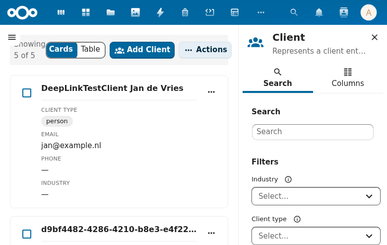
Schema-driven card for displaying an object's key information. Uses schema configuration to determine which fields to show as title, description, image, and metadata.
Wraps: NcCheckboxRadioSwitch, CnCellRenderer
Try it
Loading CnObjectCard playground…
Props
| Prop | Type | Default | Description |
|---|---|---|---|
object | Object | (required) | Object data |
schema | Object | (required) | Schema with properties and configuration |
selected | Boolean | false | Selection state |
selectable | Boolean | false | Show selection checkbox |
clickToView | Boolean | false | Body click on a selectable card emits click (navigation) instead of toggling selection — the checkbox stays the only selection surface (the card counterpart of a table's rowClickToView) |
maxMetadata | Number | 4 | Max metadata fields shown |
Schema Configuration Keys
The schema's configuration object controls card layout:
| Key | Description |
|---|---|
objectNameField | Field used as card title |
objectDescriptionField | Field used as description text |
objectImageField | Field containing image URL |
objectSummaryField | Field used as summary |
Events
| Event | Payload | Description |
|---|---|---|
click | object | Card clicked. When selectable is false this is the primary navigation event. When selectable is true a deliberate click emits select (a text-selection drag is not treated as a click); for backwards compatibility click is also emitted (with a console.warn deprecation notice) if a @click listener is present — migrate selectable consumers to @select. |
select | object | Selection toggled — emitted by the checkbox, and (when selectable) by a deliberate click anywhere on the card body. |
Slots
| Slot | Scope | Description |
|---|---|---|
#badges | \{ object \} | Badge section |
#actions | \{ object \} | Actions section |
#metadata | \{ object, fields \} | Metadata section override |
Usage
<CnObjectCard
  :object="contact"
  :schema="contactSchema"
  :selectable="true"
  @click="onCardClick"
  @select="onSelect" />
Reference (auto-generated)
The tables below are generated from the SFC source via vue-docgen-cli. They reflect what's actually in CnObjectCard.vue and update automatically whenever the component changes.
Props
| Name | Type | Required | Default | Description |
|---|---|---|---|---|
object | object | ✓ | — | The object data |
schema | object | ✓ | — | Schema definition with properties and configuration |
selected | boolean | false | Whether this card is selected | |
selectable | boolean | false | Whether to show selection checkbox | |
clickToView | boolean | false | When true, a body click on a SELECTABLE card emits click (navigation) instead of toggling selection — selection then happens via the checkbox only. The card counterpart of CnIndexPage's rowClickToView (a table row click already navigates in that mode). | |
maxMetadata | number | 4 | Maximum number of metadata fields to show |
Events
| Name | Payload | Description |
|---|---|---|
select | — | Emitted when the card toggles selection (clicking the body of a selectable card, or its checkbox). |
click | — | Emitted when a non-selectable card is clicked. Selectable cards emit select; they also emit click (deprecated) when a click listener is present, so migrate selectable consumers to @select. |
Slots
| Name | Bindings | Description |
|---|---|---|
badges | object | |
metadata | object, fields | |
actions | object |