CnSettingsCard
Collapsible card for organizing settings into sections. Used in admin settings pages.
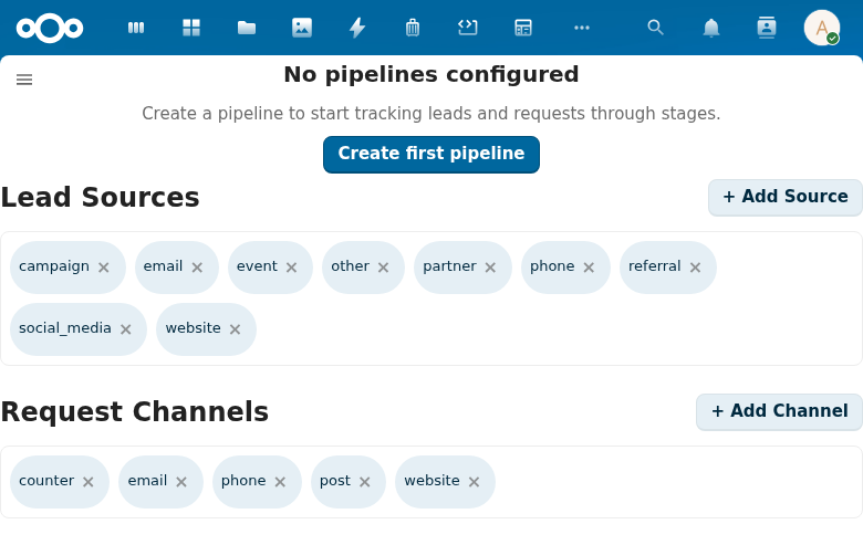
Try it
Loading CnSettingsCard playground…
Props
| Prop | Type | Default | Description |
|---|---|---|---|
title | String | '' | Card title |
icon | String | '' | Emoji or text icon displayed before the title |
collapsible | Boolean | false | Allow collapsing the card |
defaultCollapsed | Boolean | false | Whether the card starts in a collapsed state (only relevant when collapsible is true) |
Events
| Event | Payload | Description |
|---|---|---|
toggle | isCollapsed | Collapse state changed |
Slots
| Slot | Description |
|---|---|
default | Card content |
#actions | Header action buttons |
Usage
<CnSettingsCard title="General Settings" description="Basic configuration options">
  <NcTextField label="App Name" v-model="appName" />
  <NcSelect label="Default Language" v-model="language" :options="languages" />
</CnSettingsCard>
Reference (auto-generated)
The tables below are generated from the SFC source via vue-docgen-cli. They reflect what's actually in CnSettingsCard.vue and update automatically whenever the component changes.
Props
| Name | Type | Required | Default | Description |
|---|---|---|---|---|
title | string | '' | Card title text | |
icon | string | '' | Icon emoji or text displayed before the title | |
collapsible | boolean | false | Whether the card can be collapsed | |
defaultCollapsed | boolean | false | Whether the card starts collapsed (only applies when collapsible) |
Events
| Name | Payload | Description |
|---|---|---|
toggle | — | Emitted when collapse state changes. Payload: isCollapsed boolean. |
Slots
| Name | Bindings | Description |
|---|---|---|
default | — |