CnPagination
Full pagination bar with page navigation, ellipsis for large page counts, and a page-size selector. Automatically hidden when all items fit on one page.
Wraps: NcButton, NcSelect
Try it
Loading CnPagination playground…
Anatomy
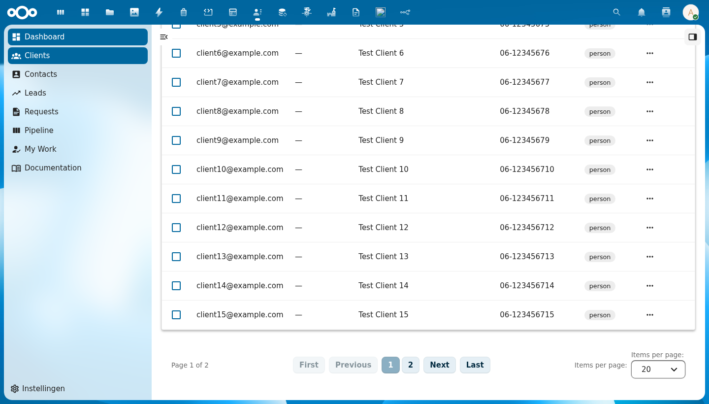
+-----------------------------------------------------------------------+
|  Page 1 of 8  |  [First] [Previous]  [1] [2] [3] … [8]  [Next] [Last]  |  Items per page: [20 ▾]
+-----------------------------------------------------------------------+
        ↑               ↑        ↑            ↑                ↑                   ↑
   page info       jump to    prev/next   page number      jump to              items per
                   first/last  buttons    buttons          first/last            page selector
| Region | Description |
|---|---|
| Page info | "Page N of N" — current page and total pages |
| First / Last | Jump directly to the first or last page; disabled when already there |
| Previous / Next | Move one page back or forward; disabled at the boundaries |
| Page numbers | Clickable page buttons; active page is highlighted. Shows up to 7 buttons with … ellipsis for large datasets |
| Items per page | Dropdown to change the page size; emits page-size-changed |
Usage
<CnPagination
  :current-page="pagination.currentPage"
  :total-pages="pagination.totalPages"
  :total-items="pagination.totalItems"
  :current-page-size="pagination.pageSize"
  @page-changed="onPageChanged"
  @page-size-changed="onPageSizeChanged" />
Props
| Prop | Type | Default | Description |
|---|---|---|---|
currentPage | Number | 1 | The currently active page (1-based) |
totalPages | Number | 1 | Total number of pages |
totalItems | Number | 0 | Total number of items across all pages — used for the page info label |
currentPageSize | Number | 20 | Currently selected number of items per page |
pageSizeOptions | Array | [{ value: 10, label: '10' }, { value: 20, label: '20' }, …] | Options shown in the "Items per page" dropdown. Each entry must be { value: number, label: string } |
minItemsToShow | Number | 10 | Minimum item count before the pagination bar is rendered; hides it when all items fit on one page |
firstLabel | String | 'First' | Accessible label for the First button |
previousLabel | String | 'Previous' | Accessible label for the Previous button |
nextLabel | String | 'Next' | Accessible label for the Next button |
lastLabel | String | 'Last' | Accessible label for the Last button |
itemsPerPageLabel | String | 'Items per page:' | Label preceding the page-size dropdown |
pageInfoFormat | String | 'Page {current} of {total}' | Format string for the page info text; {current} and {total} are replaced at runtime |
Events
| Event | Payload | Description |
|---|---|---|
page-changed | pageNum | Emitted when the user navigates to a different page; payload is the new 1-based page number |
page-size-changed | size | Emitted when the user selects a different page size |
Reference (auto-generated)
The tables below are generated from the SFC source via vue-docgen-cli. They reflect what's actually in CnPagination.vue and update automatically whenever the component changes.
Props
| Name | Type | Required | Default | Description |
|---|---|---|---|---|
currentPage | number | 1 | Current page number (1-based) | |
totalPages | number | 1 | Total number of pages | |
totalItems | number | 0 | Total number of items across all pages | |
currentPageSize | number | 20 | Current items per page | |
pageSizeOptions | array | [ \{ value: 10, label: '10' \}, \{ value: 20, label: '20' \}, \{ value: 50, label: '50' \}, \{ value: 100, label: '100' \}, \{ value: 250, label: '250' \}, \{ value: 500, label: '500' \}, \{ value: 1000, label: '1000' \}, ] | Available page size options | |
minItemsToShow | number | 10 | Minimum items before pagination is shown | |
firstLabel | string | () => t('nextcloud-vue', 'First') | Label for "First" button | |
previousLabel | string | () => t('nextcloud-vue', 'Previous') | Label for "Previous" button | |
nextLabel | string | () => t('nextcloud-vue', 'Next') | Label for "Next" button | |
lastLabel | string | () => t('nextcloud-vue', 'Last') | Label for "Last" button | |
itemsPerPageLabel | string | () => t('nextcloud-vue', 'Items per page:') | Label for "Items per page:" | |
pageInfoFormat | string | () => t('nextcloud-vue', 'Page \{current\} of \{total\}') | Page info format string. Use {current} and {total} as placeholders. "Page {current} of {total}" |
Events
| Name | Payload | Description |
|---|---|---|
page-changed | — | Emitted when page changes. Payload: new page number. |
page-size-changed | — | Emitted when page size changes. Payload: new page size. |