CnRowActions
Per-row action menu for tables and cards. Renders as a ⋯ button that opens a dropdown with the configured actions. Automatically marks destructive actions (e.g., Delete) with a danger style.
Wraps: NcActions, NcActionButton
Try it
Loading CnRowActions playground…
Anatomy
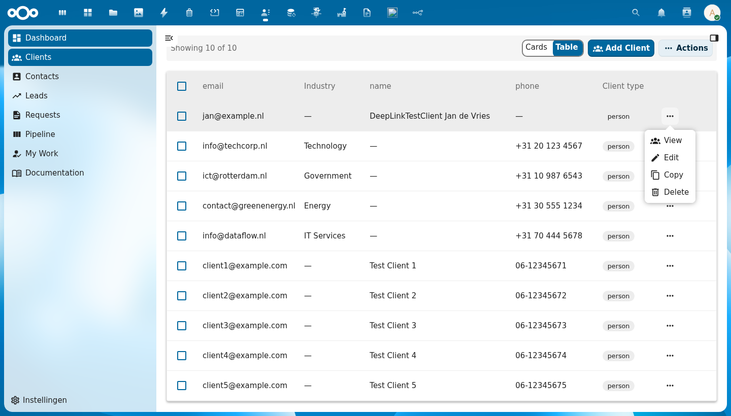
                      +----------------+
                      |  👁 View       |  ← navigate to detail
                      |  ✏ Edit        |  ← open edit form
[ ⋯ ]  ──opens──▶    |  ⊕ Copy        |  ← duplicate the object
                      |  ─────────────  |  ← divider before destructive actions
                      |  🗑 Delete     |  ← destructive: shown in red
                      +----------------+
    ↑
trigger button (last cell of every row)
| Region | Description |
|---|---|
| Trigger button | ⋯ icon button placed in the last column of the row; always visible on hover |
| Action items | Each action renders with an optional icon and label |
| Divider | Automatically inserted before the first action marked destructive: true |
| Destructive actions | Shown in the Nextcloud danger color to signal irreversible operations |
Usage
<CnRowActions
  :actions="[
    { label: 'View',   icon: EyeIcon,         handler: (row) => openDetail(row) },
    { label: 'Edit',   icon: PencilIcon,       handler: (row) => openEditDialog(row) },
    { label: 'Copy',   icon: ContentCopyIcon,  handler: (row) => copyRow(row) },
    { label: 'Delete', icon: DeleteIcon,       handler: (row) => confirmDelete(row), destructive: true },
  ]"
  :row="row"
  @action="onAction" />
The action event can be used as an alternative to handler functions:
function onAction({ action, row }) {
  // action is the label string of the clicked action
  if (action === 'Edit') openEditDialog(row)
  if (action === 'Delete') confirmDelete(row)
}
Props
| Prop | Type | Default | Description |
|---|---|---|---|
actions | Array | [] | Array of action definition objects (see Action definition below) |
row | Object | null | The row data object — passed as-is in the action event payload so handlers can access it |
primary | Boolean | false | Whether to use primary styling for the action menu trigger |
menuName | String | null | Label shown on the action menu trigger button |
Action definition
| Field | Type | Required | Description |
|---|---|---|---|
label | String | ✓ | Display text for the action item. Also used as the action key in the emitted action event. |
icon | Object|String | — | The icon to render. A component (e.g. a vue-material-design-icons component) is rendered directly. A string is treated as a CnIcon registry name (PascalCase, e.g. "Eye") and resolved via registerIcons(), falling back to the help-circle when unregistered — this lets manifest (JSON) actions declare icons by name. |
handler | Function | — | Called with the row value when the action is clicked: (row) => void |
disabled | Boolean|Function | — | When true, or when a function returning true for the given row, the item is not clickable |
visible | Boolean|Function | — | Controls whether the item appears in the menu at all. Omit for "always shown". Pass false or a function returning false for the row to hide it. Useful for state-dependent actions (e.g. show Publish only when the row is unpublished). |
title | String|Function | — | Native tooltip shown on hover. Accepts a string or a function (row) => string. Useful for explaining why a disabled entry is disabled. |
destructive | Boolean | — | When true, renders the action in danger color |
Conditional visibility example
<CnRowActions
  :actions="[
    { label: 'Publish',   icon: PublishIcon,    handler: publishRow,   visible: (row) => !row.published },
    { label: 'Depublish', icon: PublishOffIcon, handler: depublishRow, visible: (row) =>  row.published },
    { label: 'Delete',    icon: DeleteIcon,     handler: deleteRow,    destructive: true },
  ]"
  :row="row" />
Events
| Event | Payload | Description |
|---|---|---|
action | { action, row } | Emitted when an action item is clicked; action is the full action definition object, row is the value of the row prop |
Reference (auto-generated)
The tables below are generated from the SFC source via vue-docgen-cli. They reflect what's actually in CnRowActions.vue and update automatically whenever the component changes.
Props
| Name | Type | Required | Default | Description |
|---|---|---|---|---|
actions | Array<{label: string, icon: object | string, handler: Function, disabled: boolean | Function, visible: boolean | Function, title: string | Function, destructive: boolean}> | [] | Action definitions. Each action supports: - label (string, required) — display text - icon (component | string) — MDI icon. A component renders directly; a string is treated as a registry name and rendered via CnIcon (PascalCase, e.g. "Eye"), falling back to the help-circle when unregistered. The string form lets manifest (JSON) actions declare icons by name. - handler (function) — called with row on click - disabled (boolean | (row) => boolean) — gray out the entry - visible (boolean | (row) => boolean) — when false, hide the entry from the menu (default: shown) - title (string | (row) => string) — native tooltip shown on hover (useful to explain why an entry is disabled) - destructive (boolean) — apply error color styling | |
row | object | null | The row/object data (passed to action handlers) | |
primary | boolean | false | Whether to use primary styling for the action menu trigger | |
menuName | string | undefined | Label shown on the action menu trigger button |
Events
| Name | Payload | Description |
|---|---|---|
action | — |