CnDataTable
Sortable data table with row selection, loading states, and schema-driven column generation. Supports dot notation for nested values (e.g., address.city).
Wraps: NcLoadingIcon, NcCheckboxRadioSwitch, CnCellRenderer
Try it
Loading CnDataTable playground…
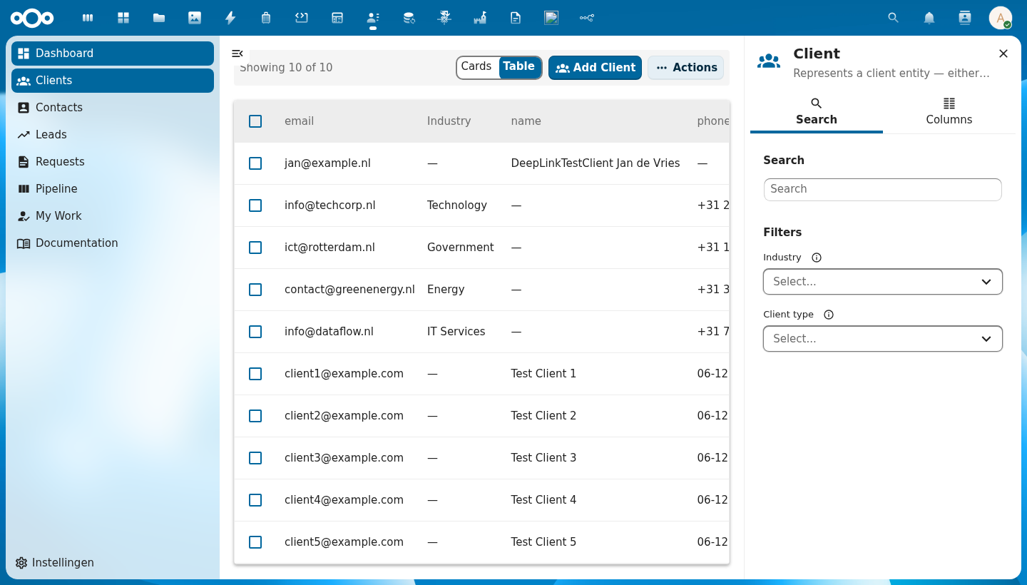
Anatomy
+--+------+----------↑---------+----------+----------+---------+----------------+
|  | sel. |  Column A ▲        | Column B | Column C | Column D| Actions header |
+--+------+--------------------+----------+----------+---------+----------------+
|☐ | 👤   | Alice van den Berg | Dept     | email@.. | Active  |⋮               |
|☐ | 👤   | Bob Jansen         | Dept     | email@.. | Pending |⋮               |
|☐ | 👤   | Carol Smit         | Dept     | email@.. | Active  |⋮               |
+--+------+--------------------+----------+----------+---------+----------------+
   ↑  ↑          ↑                                      ↑       ↑
   |  avatar   cell value                            badge    row actions
   checkbox                                          renderer
| Region | Description |
|---|---|
| Select-all checkbox | Checks/unchecks all rows on the current page |
| Column headers | Clickable to sort; cycles through ascending (▲), descending (▼), and no sort (indicator hidden) |
| Avatar / icon | Auto-generated from the row's name field via CnCellRenderer |
| Cell value | Type-aware rendering: email links, dates, booleans, status badges |
| Row actions | Per-row ⋮ menu — rendered via the #row-actions slot |
| Actions header | Slot above actions row — rendered via the #actions-header slot (only renders when row actions exist) |
| Loading overlay | Spinner centered over the table body while loading is true |
| Empty state | "No items found" message (or #empty slot) when rows array is empty |
Usage
<CnDataTable
  :schema="schema"
  :rows="objects"
  :sort-key="sortKey"
  :sort-order="sortOrder"
  :selectable="true"
  :selected-ids="selected"
  @sort="onSort"
  @select="onSelect"
  @row-click="onRowClick">
  <template #row-actions="{ row }">
    <CnRowActions :actions="rowActions" :row="row" @action="onAction" />
  </template>
</CnDataTable>
Props
| Prop | Type | Default | Description |
|---|---|---|---|
schema | Object | null | Schema object for auto-generating columns from its properties map |
columns | Array | [] | Column definitions: [{ key, label, sortable?, width?, align?, class?, cellClass?, formatter?, formatterOptions?, widget?, widgetProps?, aggregate? }]. formatter/widget/widgetProps resolve against the app's cnFormatters/cnCellWidgets registries (provided by CnAppRoot); formatterOptions is passed as the formatter's fourth argument (e.g. { currency: 'USD' } for the built-in currency formatter, or the { negative, zero, positive } phrases for conditionalPhrase) — see migrating-to-manifest → Column formatters / Column widgets. aggregate ({ register?, schema, op:"count", where }) renders the cell as a count of related OpenRegister objects (one _limit=0 request per row; @self.<path> in where interpolated per-row; … while loading, — on failure) — see migrating-to-manifest → Aggregate columns. The #column-{key} scoped slot still overrides everything. |
rowIcon | String | Function | null | Optional leading icon at the start of every row. A static MDI icon name (PascalCase, e.g. 'FileDocumentOutline') applied to all rows, or (row) => iconName to vary it per row. Resolved through the shared CnIcon registry. Unset = no icon column. |
columnOverrides | Object | {} | Per-column overrides applied on top of schema-generated columns; keyed by column key |
excludeColumns | Array | [] | Column keys to hide when using schema auto-generation |
includeColumns | Array | null | Whitelist of column keys to show; all others hidden (takes precedence over excludeColumns) |
rows | Array | [] | Array of row data objects to display |
loading | Boolean | false | Shows a loading spinner overlay while true |
loadingText | String | 'Loading...' | Accessible label for the loading spinner |
sortKey | String | null | Currently sorted column key; controls the ▲/▼ indicator. null means no column is actively sorted. |
sortOrder | String | 'asc' | Current sort direction — 'asc', 'desc', or null (no sort) |
sortKeys | Array | [] | Ordered multi-column ("shift+click") sort key list, [{ key, order }, …] (0–3 entries). When non-empty it takes precedence over sortKey/sortOrder; a single-key list is single-sort's behavior unchanged. Shift+click a sortable header to append/cycle a secondary or tertiary key. |
selectable | Boolean | false | Enables the checkbox column for multi-row selection |
rowClickToView | Boolean | false | When true, a row-body click emits row-click (for navigation) even while selectable — selection then happens only via the checkbox column ("click row = open, tick box = select") |
selectedIds | Array | [] | Array of currently selected row IDs (controlled) |
rowKey | String | 'id' | Property name used as the unique row identifier |
emptyText | String | 'No items found' | Message shown when rows is empty and no #empty slot is provided |
rowClass | Function | null | Callback (row) => cssClass to add dynamic CSS classes to rows |
cellClass | Function | null | Callback (row, col) => cssClass to add dynamic CSS classes to individual data cells |
scrollable | Boolean | false | Enables horizontal scrolling for wide tables |
selectAllLabel | String | 'Select all rows' | Accessible name (aria-label) for the select-all checkbox in the header row, so screen readers announce a named control (WCAG 4.1.2) |
selectRowLabel | String | 'Select row' | Accessible name (aria-label) for each per-row select checkbox, so screen readers announce a named control (WCAG 4.1.2) |
hideHeader | Boolean | false | Hide the column-header row (<thead>). Useful for compact dashboard list widgets that want a plain bordered-row list without column labels. |
fixedLayout | Boolean | false | Switch to table-layout: fixed, making each column's width authoritative instead of a hint the browser may override from cell content. Opt in when content would otherwise dictate the layout: a long unbreakable value (a PHP FQCN, a UUID) widens its own column under the default auto layout and can paint past the cell box into its neighbour, while a column left unsized soaks up all remaining width. Cells break long words rather than overflowing. Columns with no width share what is left, so size every column when you want exact control — percentages summing to 100 are the easiest to reason about. |
fillHeight | Boolean | false | Fill the parent's height (a flex-column card / widget content area) so an optional #footer is pushed to the bottom instead of floating under a short list; the footer stays pinned via its sticky rule when the list overflows. No-op outside a height-constrained parent — opt-in so ordinary in-flow tables are unaffected. |
Events
| Event | Payload | Description |
|---|---|---|
sort | { key, order } | Emitted when a sortable column header is clicked. Cycles through asc → desc → null. When the user clears the sort, both key and order are null. |
select | ids[] | Emitted when row selection changes; payload is the full updated selection array |
select-all | isSelectAll | Emitted when the select-all checkbox is toggled |
row-click | row | Emitted when a data row is clicked (not the checkbox). Only fires when selectable is false — when selectable is true, a deliberate click anywhere on a row toggles its selection (emitting select) instead — a text-selection drag is not treated as a click. |
row-context-menu | { row, event } | Emitted when a data row is right-clicked. The native contextmenu event is prevented. Used by CnIndexPage with the useContextMenu composable to show a context menu at the cursor position. |
Slots
| Slot | Scope | Description |
|---|---|---|
#column-{key} | { row, value } | Override the cell renderer for a specific column key |
#row-actions | { row } | Content for the last (actions) cell of each row — typically CnRowActions |
#actions-header | - | Content for the header above the actions cell — typically a button |
#empty | — | Custom empty-state content shown when rows is empty |
Reference (auto-generated)
The tables below are generated from the SFC source via vue-docgen-cli. They reflect what's actually in CnDataTable.vue and update automatically whenever the component changes.
Props
| Name | Type | Required | Default | Description |
|---|---|---|---|---|
columns | Array<{key: string, label: string, description: string, sortable: boolean, width: string, class: string, cellClass: string}|string> | [] | Column definitions (manual mode). Not required when schema is provided. Each entry may be a full column object OR a bare string key; bare strings are normalised to { key, label } by effectiveColumns so manifest-driven pages that pass config.columns as a string array work without extra mapping. description renders as the header cell's tooltip and marks the label with a dotted underline, so a column whose meaning is not obvious from its name (a maturity level, a computed score, a domain term) can explain itself where the reader is looking. columnsFromSchema fills it from the JSON Schema property description automatically, so schema-driven tables get it for free. | |
rowIcon | string | ((row: object) => string) | null | null | Optional leading icon shown at the start of every row. Either a static MDI icon name (PascalCase, e.g. 'FileDocumentOutline') applied to all rows, or a function (row) => iconName to vary it per row. The icon is resolved through the shared CnIcon registry. Unset = no icon column. | |
schema | object | null | Schema object with properties field (schema-driven mode). When provided, columns are auto-generated from schema properties. | |
columnOverrides | object | \{\} | Per-column overrides when using schema mode: { key: { width, label, sortable, ... } } | |
excludeColumns | array | [] | Column keys to exclude when using schema mode | |
includeColumns | array | null | Column keys to include when using schema mode (whitelist) | |
rows | array | [] | Row data array. Each row should have a unique identifier (see rowKey). | |
loading | boolean | false | Whether data is loading (shows loading spinner) | |
sortKey | string | null | Current sort column key | |
sortOrder | string | 'asc' | Current sort order: 'asc', 'desc', or null (no sort) | |
sortKeys | Array<{key: string, order: 'asc'|'desc'}> | [] | Ordered multi-column sort state: [{ key, order }, ...] (priority order, 0 to 3 entries). Optional — when empty (the default), the table falls back to the legacy sortKey/sortOrder props, so single-sort hosts are completely unaffected. Shift+click a sortable header to append/cycle a secondary or tertiary key (see src/utils/multiColumnSort.js). | |
selectable | boolean | false | Whether rows can be selected with checkboxes | |
selectedIds | array | [] | Array of currently selected row IDs | |
rowKey | string | 'id' | Property name used as unique row identifier | |
emptyText | string | () => t('nextcloud-vue', 'No items found') | Text shown when there are no rows | |
rowClass | func | null | Function returning CSS class(es) for a row: (row) => string|object | |
cellClass | func | null | Function returning CSS class(es) for a data cell: (row, col) => string|object | |
scrollable | boolean | false | Whether to constrain table height and make it scrollable | |
loadingText | string | () => t('nextcloud-vue', 'Loading...') | Text shown while loading | |
selectAllLabel | string | () => t('nextcloud-vue', 'Select all rows') | Accessible name for the select-all checkbox in the header row. Used as the checkbox's aria-label so screen readers announce a named control (WCAG 4.1.2). Defaults to the lib's translation of "Select all rows". | |
selectRowLabel | string | () => t('nextcloud-vue', 'Select row') | Accessible name for a per-row select checkbox. Used as the checkbox's aria-label so screen readers announce a named control (WCAG 4.1.2). Defaults to the lib's translation of "Select row". | |
title | string | '' | Optional card title rendered in a header above the table. When set, the table reads as a self-contained card (the container's own border/radius is the card chrome). Folded in from the retired CnTableWidget. | |
borderless | boolean | false | Drop the container's card chrome (border, radius, shadow) so the table sits flush inside a parent that already provides a card (e.g. a CnWidgetWrapper dashboard slot). Folded in from CnTableWidget. | |
fillHeight | boolean | false | Fill the height of the parent (a flex-column card / widget content area) so the optional #footer is pushed to the bottom instead of floating directly under a short list. When the list is long enough to overflow, the footer stays pinned via its sticky rule. No-op outside a height-constrained parent. Opt-in so ordinary in-flow tables are unaffected. | |
hideHeader | boolean | false | Hide the column-header row (<thead>). Useful for compact dashboard list widgets that want a plain bordered-row list without column labels. | |
fixedLayout | boolean | false | Switch the table to table-layout: fixed, making each column's width authoritative instead of a hint the browser may override. Opt in when a column's content would otherwise dictate the layout — a long unbreakable value (a PHP FQCN, a UUID) widens its column under the default auto layout and can render past the cell box into its neighbour, while any column left unsized soaks up all remaining width. Cells also break long words rather than overflowing. Columns with no width share whatever space is left, so size every column when you want exact control. | |
limit | number | 0 | Max number of rows to display. When the total exceeds it, only the first limit render and the "View all" footer appears (with viewAllRoute). 0 = show all. Folded in from CnTableWidget. | |
viewAllRoute | union | null | vue-router route object for the "View all" footer link. The footer only shows when set AND the rows are a limit-ed subset. Folded in from CnTableWidget. | |
viewAllLabel | string | () => t('nextcloud-vue', 'View all') | Pre-translated "View all" footer label. | |
register | union | null | Self-fetch mode (folded from CnTableWidget): the OpenRegister register id/slug. When register + schemaId are set and no rows are passed, the table fetches /apps/openregister/api/objects/{register}/{schemaId}. | |
schemaId | union | null | Self-fetch mode (folded from CnTableWidget): the OpenRegister schema id used together with register. (Distinct from the schema prop, which is a JSON Schema object for column generation.) | |
fetchParams | union | null | Extra query parameters sent with the self-fetch request (register + schemaId mode) — e.g. a resolved filter map, _order[field] ordering, or _limit. Changing it re-triggers the self-fetch, so a host widget (CnWidgetObjectTable's declarative source) can drive filtering and ordering without re-implementing the fetch. Ignored when external rows are supplied. | |
rowClickRoute | union | null | Convenience navigation (folded from CnTableWidget): a function that receives the clicked row and returns a vue-router route to push. When set, a row click navigates there (the row-click event still fires). | |
rowClickToView | boolean | false | When true, a row-body click emits row-click (for navigation) even while selectable — selection then happens only via the checkbox column. Lets "click row = open, tick box = select" coexist. Default false keeps the legacy behaviour (selectable rows select on body click). |
Events
| Name | Payload | Description |
|---|---|---|
row-click | — | Emitted on a row-body click for navigation. Fires when selectable is false, OR when rowClickToView is set (selection then happens via the checkbox column). |
row-context-menu | — | Emitted on a row right-click (contextmenu) for hosts that render a context menu. |
select | — | Emitted when row selection changes. Payload: array of selected IDs. |
select-all | — | Emitted when select-all checkbox is toggled. |
sort | — | Emitted when a sortable column header is clicked (plain click) or shift-clicked (multi-sort). |
Slots
| Name | Bindings | Description |
|---|---|---|
actions-header | — | Header cell content above the row-actions column (blank by default). |
empty | — | Empty-state content shown when there are no rows (defaults to emptyText). |
'column-' + col.key | name, row, value | Per-column cell override (#column-<key>), scoped with { row, value }. Wins over CnCellRenderer. |
row-actions | row | Per-row actions menu (e.g. a CnRowActions), scoped with { row }. Supplying it adds the trailing actions column. |
footer | total, shown | Custom footer content, scoped with { total, shown } (defaults to the built-in "View all" link). |
Card / widget mode (folded from CnTableWidget)
CnDataTable is now the single table component — the deprecated CnTableWidget's
features are folded in here as opt-in props (bare-table usage is unchanged):
title— render a card header (title + total-count badge) above the table.borderless— drop the container's card chrome so the table sits flush inside a parent card (e.g. aCnWidgetWrapperdashboard slot).limit— show only the first N rows; withviewAllRoutea "View all" footer appears.viewAllRoute/viewAllLabel— the footer link's route and label.register+schemaId— self-fetch rows from OpenRegister when norowsare passed.fetchParams— extra query params for the self-fetch (a resolved filter map,_order[field]ordering,_limit); changing it re-triggers the fetch. Used byCnWidgetObjectTable's declarativesource.rowClickRoute— a function mapping a clicked row to a vue-router route to push.hideHeader— drop the column-label row for a compact list widget.#footerslot ({ total, shown }) — supply a custom footer link (e.g. "+ New" or an always-shown "View all") with its own handler; works outside a vue-router context.