CnDataTable
Sortable data table with row selection, loading states, and schema-driven column generation. Supports dot notation for nested values (e.g., address.city).
Wraps: NcLoadingIcon, NcCheckboxRadioSwitch, CnCellRenderer
Try it
Loading CnDataTable playground…
Anatomy
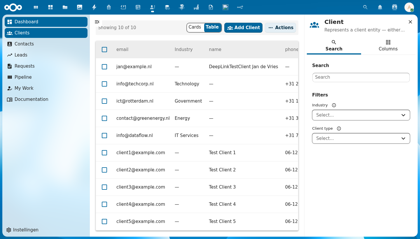
+--+------+----------↑---------+----------+----------+---------+----------------+
|  | sel. |  Column A ▲        | Column B | Column C | Column D| Actions header |
+--+------+--------------------+----------+----------+---------+----------------+
|☐ | 👤   | Alice van den Berg | Dept     | email@.. | Active  |⋮               |
|☐ | 👤   | Bob Jansen         | Dept     | email@.. | Pending |⋮               |
|☐ | 👤   | Carol Smit         | Dept     | email@.. | Active  |⋮               |
+--+------+--------------------+----------+----------+---------+----------------+
   ↑  ↑          ↑                                      ↑       ↑
   |  avatar   cell value                            badge    row actions
   checkbox                                          renderer
| Region | Description |
|---|---|
| Select-all checkbox | Checks/unchecks all rows on the current page |
| Column headers | Clickable to sort; cycles through ascending (▲), descending (▼), and no sort (indicator hidden) |
| Avatar / icon | Auto-generated from the row's name field via CnCellRenderer |
| Cell value | Type-aware rendering: email links, dates, booleans, status badges |
| Row actions | Per-row ⋮ menu — rendered via the #row-actions slot |
| Actions header | Slot above actions row — rendered via the #actions-header slot (only renders when row actions exist) |
| Loading overlay | Spinner centered over the table body while loading is true |
| Empty state | "No items found" message (or #empty slot) when rows array is empty |
Usage
<CnDataTable
  :schema="schema"
  :rows="objects"
  :sort-key="sortKey"
  :sort-order="sortOrder"
  :selectable="true"
  :selected-ids="selected"
  @sort="onSort"
  @select="onSelect"
  @row-click="onRowClick">
  <template #row-actions="{ row }">
    <CnRowActions :actions="rowActions" :row="row" @action="onAction" />
  </template>
</CnDataTable>
Props
| Prop | Type | Default | Description |
|---|---|---|---|
schema | Object | null | Schema object for auto-generating columns from its properties map |
columns | Array | [] | Column definitions: [{ key, label, sortable?, width?, align?, class?, cellClass?, formatter?, widget?, widgetProps?, aggregate? }]. formatter/widget/widgetProps resolve against the app's cnFormatters/cnCellWidgets registries (provided by CnAppRoot) — see migrating-to-manifest → Column formatters / Column widgets. aggregate ({ register?, schema, op:"count", where }) renders the cell as a count of related OpenRegister objects (one _limit=0 request per row; @self.<path> in where interpolated per-row; … while loading, — on failure) — see migrating-to-manifest → Aggregate columns. The #column-{key} scoped slot still overrides everything. |
rowIcon | String | Function | null | Optional leading icon at the start of every row. A static MDI icon name (PascalCase, e.g. 'FileDocumentOutline') applied to all rows, or (row) => iconName to vary it per row. Resolved through the shared CnIcon registry. Unset = no icon column. |
columnOverrides | Object | {} | Per-column overrides applied on top of schema-generated columns; keyed by column key |
excludeColumns | Array | [] | Column keys to hide when using schema auto-generation |
includeColumns | Array | null | Whitelist of column keys to show; all others hidden (takes precedence over excludeColumns) |
rows | Array | [] | Array of row data objects to display |
loading | Boolean | false | Shows a loading spinner overlay while true |
loadingText | String | 'Loading...' | Accessible label for the loading spinner |
sortKey | String | null | Currently sorted column key; controls the ▲/▼ indicator. null means no column is actively sorted. |
sortOrder | String | 'asc' | Current sort direction — 'asc', 'desc', or null (no sort) |
selectable | Boolean | false | Enables the checkbox column for multi-row selection |
rowClickToView | Boolean | false | When true, a row-body click emits row-click (for navigation) even while selectable — selection then happens only via the checkbox column ("click row = open, tick box = select") |
selectedIds | Array | [] | Array of currently selected row IDs (controlled) |
rowKey | String | 'id' | Property name used as the unique row identifier |
emptyText | String | 'No items found' | Message shown when rows is empty and no #empty slot is provided |
rowClass | Function | null | Callback (row) => cssClass to add dynamic CSS classes to rows |
cellClass | Function | null | Callback (row, col) => cssClass to add dynamic CSS classes to individual data cells |
scrollable | Boolean | false | Enables horizontal scrolling for wide tables |
selectAllLabel | String | 'Select all rows' | Accessible name (aria-label) for the select-all checkbox in the header row, so screen readers announce a named control (WCAG 4.1.2) |
selectRowLabel | String | 'Select row' | Accessible name (aria-label) for each per-row select checkbox, so screen readers announce a named control (WCAG 4.1.2) |
Events
| Event | Payload | Description |
|---|---|---|
sort | { key, order } | Emitted when a sortable column header is clicked. Cycles through asc → desc → null. When the user clears the sort, both key and order are null. |
select | ids[] | Emitted when row selection changes; payload is the full updated selection array |
select-all | isSelectAll | Emitted when the select-all checkbox is toggled |
row-click | row | Emitted when a data row is clicked (not the checkbox). Only fires when selectable is false — when selectable is true, a deliberate click anywhere on a row toggles its selection (emitting select) instead — a text-selection drag is not treated as a click. |
row-context-menu | { row, event } | Emitted when a data row is right-clicked. The native contextmenu event is prevented. Used by CnIndexPage with the useContextMenu composable to show a context menu at the cursor position. |
Slots
| Slot | Scope | Description |
|---|---|---|
#column-{key} | { row, value } | Override the cell renderer for a specific column key |
#row-actions | { row } | Content for the last (actions) cell of each row — typically CnRowActions |
#actions-header | - | Content for the header above the actions cell — typically a button |
#empty | — | Custom empty-state content shown when rows is empty |
Reference (auto-generated)
The tables below are generated from the SFC source via vue-docgen-cli. They reflect what's actually in CnDataTable.vue and update automatically whenever the component changes.
Props
| Name | Type | Required | Default | Description |
|---|---|---|---|---|
columns | Array<{key: string, label: string, sortable: boolean, width: string, class: string, cellClass: string}|string> | [] | Column definitions (manual mode). Not required when schema is provided. Each entry may be a full column object OR a bare string key; bare strings are normalised to { key, label } by effectiveColumns so manifest-driven pages that pass config.columns as a string array work without extra mapping. | |
rowIcon | string | ((row: object) => string) | null | null | Optional leading icon shown at the start of every row. Either a static MDI icon name (PascalCase, e.g. 'FileDocumentOutline') applied to all rows, or a function (row) => iconName to vary it per row. The icon is resolved through the shared CnIcon registry. Unset = no icon column. | |
schema | object | null | Schema object with properties field (schema-driven mode). When provided, columns are auto-generated from schema properties. | |
columnOverrides | object | \{\} | Per-column overrides when using schema mode: { key: { width, label, sortable, ... } } | |
excludeColumns | array | [] | Column keys to exclude when using schema mode | |
includeColumns | array | null | Column keys to include when using schema mode (whitelist) | |
rows | array | [] | Row data array. Each row should have a unique identifier (see rowKey). | |
loading | boolean | false | Whether data is loading (shows loading spinner) | |
sortKey | string | null | Current sort column key | |
sortOrder | string | 'asc' | Current sort order: 'asc', 'desc', or null (no sort) | |
selectable | boolean | false | Whether rows can be selected with checkboxes | |
selectedIds | array | [] | Array of currently selected row IDs | |
rowKey | string | 'id' | Property name used as unique row identifier | |
emptyText | string | () => t('nextcloud-vue', 'No items found') | Text shown when there are no rows | |
rowClass | func | null | Function returning CSS class(es) for a row: (row) => string|object | |
cellClass | func | null | Function returning CSS class(es) for a data cell: (row, col) => string|object | |
scrollable | boolean | false | Whether to constrain table height and make it scrollable | |
loadingText | string | () => t('nextcloud-vue', 'Loading...') | Text shown while loading | |
selectAllLabel | string | () => t('nextcloud-vue', 'Select all rows') | Accessible name for the select-all checkbox in the header row. Used as the checkbox's aria-label so screen readers announce a named control (WCAG 4.1.2). Defaults to the lib's translation of "Select all rows". | |
selectRowLabel | string | () => t('nextcloud-vue', 'Select row') | Accessible name for a per-row select checkbox. Used as the checkbox's aria-label so screen readers announce a named control (WCAG 4.1.2). Defaults to the lib's translation of "Select row". | |
title | string | '' | Optional card title rendered in a header above the table. When set, the table reads as a self-contained card (the container's own border/radius is the card chrome). Folded in from the retired CnTableWidget. | |
borderless | boolean | false | Drop the container's card chrome (border, radius, shadow) so the table sits flush inside a parent that already provides a card (e.g. a CnWidgetWrapper dashboard slot). Folded in from CnTableWidget. | |
limit | number | 0 | Max number of rows to display. When the total exceeds it, only the first limit render and the "View all" footer appears (with viewAllRoute). 0 = show all. Folded in from CnTableWidget. | |
viewAllRoute | union | null | vue-router route object for the "View all" footer link. The footer only shows when set AND the rows are a limit-ed subset. Folded in from CnTableWidget. | |
viewAllLabel | string | () => t('nextcloud-vue', 'View all') | Pre-translated "View all" footer label. | |
register | union | null | Self-fetch mode (folded from CnTableWidget): the OpenRegister register id/slug. When register + schemaId are set and no rows are passed, the table fetches /apps/openregister/api/objects/{register}/{schemaId}. | |
schemaId | union | null | Self-fetch mode (folded from CnTableWidget): the OpenRegister schema id used together with register. (Distinct from the schema prop, which is a JSON Schema object for column generation.) | |
rowClickRoute | union | null | Convenience navigation (folded from CnTableWidget): a function that receives the clicked row and returns a vue-router route to push. When set, a row click navigates there (the row-click event still fires). | |
rowClickToView | boolean | false | When true, a row-body click emits row-click (for navigation) even while selectable — selection then happens only via the checkbox column. Lets "click row = open, tick box = select" coexist. Default false keeps the legacy behaviour (selectable rows select on body click). |
Events
| Name | Payload | Description |
|---|---|---|
row-context-menu | — | |
row-click | — | Emitted on a row-body click for navigation. Fires when selectable is false, OR when rowClickToView is set (selection then happens via the checkbox column). |
sort | — | Emitted when a sortable column header is clicked. |
select | — | Emitted when row selection changes. Payload: array of selected IDs. |
select-all | — | Emitted when select-all checkbox is toggled. |
Slots
| Name | Bindings | Description |
|---|---|---|
actions-header | — | |
empty | — | |
'column-' + col.key | name, row, value | |
row-actions | row |
Card / widget mode (folded from CnTableWidget)
CnDataTable is now the single table component — the deprecated CnTableWidget's
features are folded in here as opt-in props (bare-table usage is unchanged):
title— render a card header (title + total-count badge) above the table.borderless— drop the container's card chrome so the table sits flush inside a parent card (e.g. aCnWidgetWrapperdashboard slot).limit— show only the first N rows; withviewAllRoutea "View all" footer appears.viewAllRoute/viewAllLabel— the footer link's route and label.register+schemaId— self-fetch rows from OpenRegister when norowsare passed.rowClickRoute— a function mapping a clicked row to a vue-router route to push.