CnCellRenderer
Type-aware cell renderer for schema-driven tables. Automatically formats values based on the schema property type.
Wraps: CnStatusBadge, CheckBold icon
Try it
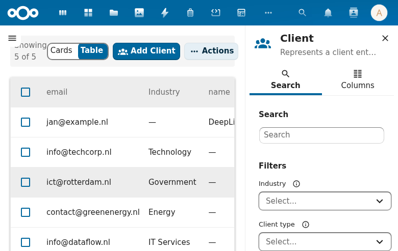
Props
| Prop | Type | Default | Description |
|---|---|---|---|
value | any | null | Cell value |
property | Object | \{\} | Schema property definition |
formatter | String | null | Optional cell-formatter id. When set and resolvable in the injected cnFormatters registry (provided by CnAppRoot), the cell renders cnFormatters[formatter](value, row, property, formatterOptions) as text — overriding the type-aware rendering. Built-in formatters (registered by CnAppRoot by default): "date" (Intl.DateTimeFormat dateStyle:"medium"), "datetime" (date + timeStyle:"short"), "relative-time" (Intl.RelativeTimeFormat, "3 days ago"), "daysUntil" (future-oriented deadline phrasing: "N days remaining" / "Due today" / "N days overdue" — plural-aware via translatePlural), "daysSince" (elapsed-day phrasing: "N days ago" / "Today"), "relativeDate" (today, yesterday, then the short date; formatterOptions { time: true } adds the time of day: "vandaag, 09:42"), "currency" (Intl.NumberFormat currency in the user's language, EUR default; formatterOptions.currency / .currencyField / .decimals override; currencyField reads the code from the row), "conditionalPhrase" (sign/zero-based phrase selection over a numeric field — formatterOptions { negative, zero, positive } pre-translated phrases with {n} replaced by the absolute value; generalizes daysUntil), "count" (summarises a collection-valued cell as an entry count — array entries, object keys, a collection persisted as a JSON string, or a present scalar counting as 1, with every empty value including 0 / false taking the zero phrase — with formatterOptions { singular, plural, zero } pre-translated phrases and {n} substituted; without phrases, the bare count), "connectionStatus" (a connection registry status: configured, limited, unconfigured, simulated, disabled, unavailable and error render as Configured, Limited, Not configured, Simulated, Switched off, Not available and Error, and any other value passes through unchanged), "connectionSettingsLabel" ("Open settings" when the row's settingsUrl is a non-empty string, otherwise empty), "masked" (all but the last formatterOptions.visible characters, default 4, as *, at most five: *****4300; display only, NOT an access control, because the full value is still in the row the page received; hide a value the reader must not have in OpenRegister). All built-ins are safe against null/empty/non-parseable input (return '' / original value, no throw). Consumer-registered formatters with the same id win. Unknown id / missing registry / a throwing formatter all fall back. See migrating-to-manifest → Column formatters. |
formatterOptions | Object | null | Declarative options map passed as the formatter's fourth argument (e.g. { currency: 'USD' } for "currency", or the { negative, zero, positive } phrases for "conditionalPhrase"). Declared on a table column as formatterOptions. Additive: three-argument formatters simply ignore it. |
widget | String | null | Optional cell-widget id. When it resolves in the injected cnCellWidgets registry (provided by CnAppRoot), the cell renders that component with { value, row, property, formatted, ...widgetProps }. Built-ins (resolved without a registry entry): "badge" → CnStatusBadge (an enum value shows its x-enum-labels label, translated, unless a formatter is set; a list draws one chip per entry, each labelled from the items' x-enum-labels, and in the board look as the small 18px tag; widgetProps.colorMap is looked up by the stored value when it has an entry for it; "link" and format.style: "swatch" show the same label); "fkResolve" → CnFkResolveCell (resolves a reference uuid — or an array of them — to the related object's display label via the shared object store with per-schema caching; config widgetProps { register, schema, labelField }; unresolvable ids degrade to the raw id. matchField finds the record by that property instead of its id, such as a person by ncUserId, and shows nothing until the lookup answers. refField names a row field holding the record's id, tried first; a list of ids pairs with a list of values by position. labelTemplate ("{givenName} {familyName}") or labelPath ("applicant.name") builds the label before labelField); "fkResolve" → CnFkResolveCell (resolves a reference uuid — or an array of them — to the related object's display label via the shared object store with per-schema caching; config widgetProps { register, schema, labelField }; unresolvable ids degrade to the raw id); "refLabel" → the label of a referenced object, already resolved in a batch (widgetProps { labels: { id: label|null }, route? }; an id still pending shows …, one that did not resolve shows the id in mono; with route each label links to that page for the referenced id; CnIndexPage sets it for a column with labelField); "link" → a router-link (when widgetProps.route is set, a manifest page id, or when widgetProps.routeField + widgetProps.routeMap pick the page per row from a sibling field, with route as the fallback) / external <a target="_blank"> (when widgetProps.href is set, with {key} placeholder substitution from the row) / plain text + once-per-session console.warn when neither resolves (set widgetProps.fallback:"silent" to suppress the warn). "switch" → an on/off switch labelled with the value (widgetProps { checked(row), onToggle(row, on), type? }; it shows the new state at once and returns to the old one when onToggle rejects; clicks stay in the cell; type: "checkbox" draws a checkbox; without checked a formatter that answers true or false decides the state); "actions" → row actions as inline buttons (widgetProps { items, run }: items a list, or a function of the row returning one, of { key, label, variant?, disabled? }; a click calls run(key, row) and does not reach the row; CnIndexPage fills both for a column with widget: "actions" and widgetProps.actions: [<row action id or label>]); "iconLabel" → an icon before the value (widgetProps.icon: a component, an icon name, or a function of the row returning one; widgetProps.icons: a map from the stored value to an icon name, icon for a value without an entry). Takes precedence over formatter / the type-aware rendering (the widget gets the formatter-shaped value as formatted when formatter is also set). Consumer-registered widgets with the same id override the built-ins. Unknown id falls back. See migrating-to-manifest → Column widgets. |
widgetProps | Object | \{\} | Extra props spread onto the resolved cell-widget component. Recognised by the built-ins: variant (badge), colorMap (badge — a { value: variant } map, e.g. { placed: 'primary', delivered: 'success' }, resolved per label by CnStatusBadge; falls back to variant), register + schema + labelField + matchField + refField + labelTemplate + labelPath (fkResolve), labels + route (refLabel), route + params (link router-link), href (link external anchor), fallback:"silent" (link no-warn). |
secondary | String | '' | The column's secondary line (a muted second line under the value). The "avatar" widget draws it under the name, beside the picture; CnDataTable passes it for an avatar column and does not draw it again under the cell. Other cells ignore it. |
format | Object | null | Optional declarative cell-format — a no-code alternative to a registry formatter. Recognised style values: "currency" (Intl currency, e.g. € 1.234,56; honours currency ISO code default "EUR" and decimals default 2; minorUnits: true reads a value stored in cents as the amount, so -990 shows € -9,90), "number" / "percent" (localized number, percent appends %; decimals default 0), "duration" (a seconds value rendered compact like 1u 23m / 45m 10s / 12s; pass unit: "milliseconds" / "minutes" / "hours" when the raw value is not seconds — a sub-second milliseconds value renders as 245ms rather than flooring to 0s), and "swatch" (a colour dot read from the sibling row field named by colorField, default "color", beside the cell text). prefix / suffix wrap the numeric/duration styles. Resolved AFTER formatter / widget (those win), BEFORE the type-aware default. |
row | Object | \{\} | The full row object — passed so a formatter can be a function of the whole record (e.g. "days since @self.updated"), not just this one cell value. Also the source of a format:"swatch" cell's colour field. |
rowKey | String | 'id' | Row identifier field — used by the built-in widget:"link" when widgetProps.params is not declared (default param map is { id: row[rowKey] }). |
truncate | Number | 100 | Max string length before truncation |
Avatar and date cells
Two more built-in cell widgets, both set with widget on a column.
"avatar" shows a person: a picture and the name beside it.
{ "key": "handlerName", "label": "Handler", "widget": "avatar", "widgetProps": { "userField": "handler" } }
widgetProps key | Description |
|---|---|
userField | Row field that holds the Nextcloud user id. The cell then shows that user's avatar. |
The "date" widget takes two more widgetProps keys: showTime: true adds the time of day ("5 Oct 2026, 08:30") and timeOnly: true shows the time alone ("08:30"), for a timetable row. The default is the date alone. short: true writes the board's short date in any look ("5 okt", "14 feb 2024" outside this year), with showTime followed by the time ("5 okt, 09:15").
widgetProps: { relative: true } makes the "date" widget say "today" and "yesterday" and, from the day before, the short date ("5 okt"); with showTime: true the time of day follows ("vandaag, 09:42", "gisteren, 23:12"). The full date and time is the tooltip. The record-list templates take the same through {path|relative} and {path|relativetime}. Without relative nothing changes.
widgetProps: { due: { emptyText: "Geen deadline" } } reads the date as a due text: "N days overdue" in the error colour, "Due today", "tomorrow" or the short date, and emptyText for an empty cell. The keys are those of the record list's due (todayLabel, overdueLabel, upcomingLabel, upcomingWeeksLabel, upcomingWeeksFrom, emptyText).
due.activeWhen ({ field, equals? | in? | lt? | gt? }, the row-indicator grammar) makes the date due only while the condition holds on the row. Otherwise the cell reads the short date with no colour, never overdue or due soon. A won lead's close date is history, not a deadline:
{ "key": "expectedCloseDate", "widget": "date", "widgetProps": { "due": { "soonWithin": 7, "activeWhen": { "field": "status", "equals": "open" } } } }
The monospace uuid style (format: "uuid") applies only when the value is a uuid and nothing resolves it: a reference a formatter or a widget resolved to its name renders in the normal text style.
| user | true when the cell value itself is the user id. |
| nameField | Row field that holds the name to show. Defaults to the cell value. |
| size | Picture size in pixels. Default 24. |
Without a user id the cell shows the initials of the name, such as "PV" for "Pieter de Vries". The picture is decoration and hidden from screen readers. The name is the text.
"date" shows a date whose colour follows rules on how far away it is.
{
  "key": "deadline",
  "label": "Deadline",
  "widget": "date",
  "widgetProps": {
    "variantWhen": [
      { "op": "lt", "value": 0, "variant": "error" },
      { "op": "lte", "value": 5, "variant": "warning" }
    ]
  }
}
Each rule compares the number of days until the date: 0 is today, a negative number is overdue. The first rule that matches wins. variant is success, warning, error or default. A date that matched a rule is also set in a heavier weight, so the signal does not rest on colour alone. The same rules are available as resolveDateVariant, for a board card or any other place a deadline shows.
Under the board look (look: "board") a date cell, the "date" widget without showTime or timeOnly and a schema date / date-time property alike, reads the board's short form: day and short month in the user's language ("5 okt"), with the year only outside the current year ("14 feb 2024"). The full date is the tooltip. Without the look nothing changes.
"age" shows how long something has waited since the date: hours under a day ("4 hours", "4 uur"), whole calendar days after that ("1 day", "3 dagen"). Rules in widgetProps.variantWhen colour it, compared against the number of days the cell shows (0 under a day):
{ "key": "occurredAt", "label": "Waiting", "widget": "age", "widgetProps": { "variantWhen": [{ "op": "gte", "value": 3, "variant": "error" }] } }
A cell that matched a rule is set in weight 600; under the board look every age cell is. The full date and time is the tooltip.
Progress cells
widget: "progress" draws a score or a share as PqLeads' Winkans column does: a 56 x 8 bar, the percentage 8px beside it in bold, both in the bar's tone, and an optional age badge after them.
{
  "key": "qualificationScore",
  "label": "Winkans",
  "widget": "progress",
  "widgetProps": {
    "fallbackFields": ["probability"],
    "thresholds": { "good": 60, "warn": 30 },
    "badge": { "label": "Out of date {days} days", "dateField": "@self.updated", "afterDays": 14, "when": { "status": "open" } }
  }
}
widgetProps key | Meaning |
|---|---|
max | The value that is 100% (default 100). The percentage is rounded and clamped to 0..100. |
fallbackFields | Row fields read, in order, when the cell value is empty. With no number anywhere the cell shows a dash. |
thresholds | { good, warn }, default { good: 60, warn: 30 }: at or above good success, at or above warn warning, below error. |
lowerIsBetter | Turn the scale around (a risk score). |
badge | { label, dateField?, afterDays, when?, tone? }: shown when the row's dateField (default @self.updated) lies afterDays or more calendar days back and every when field equals its value (an empty field does not block). label goes through the host translate function and takes {days}. tone is error (default), warning or success. |
Number cells
widget: "number" shows a count with its unit, and a chip with text when a row field says the count is a problem. An empty value is an empty cell, never 0.
{
  "key": "currentStatusDwellDays",
  "label": "Days in status",
  "widget": "number",
  "widgetProps": {
    "unit": { "one": "{count} working day", "other": "{count} working days" },
    "flagWhen": { "field": "statusDwellBreached", "equals": true, "text": "stuck", "variant": "warning" }
  }
}
widgetProps key | Meaning |
|---|---|
unit | { one, other } with {count}, through the host translate function. Without it the cell shows the number in the user's locale. |
flagWhen | { field, equals?, in?, lt?, gt?, text, variant? }: when the row's field holds (equals, in, a number below lt or above gt, or truthiness, as a row indicator reads it), a CnStatusBadge chip with the translated text sits beside the number and the number takes the variant's text colour. variant defaults to warning. The chip carries the meaning in text, never in colour alone. |
Badge tooltips
The built-in badge takes widgetProps.titleWhen: { field, equals?, in?, text }: when the row's field holds, the pill carries the translated text as its tooltip ("Priority set by hand"). A column can show one row field and sort on another with the column's valueField (see CnDataTable), so a priority column sorts on its stored order and shows the word:
{ "key": "priorityOrder", "valueField": "priority", "label": "Priority", "widget": "badge", "colorMap": { "low": "default", "normal": "info", "high": "warning", "urgent": "error" }, "widgetProps": { "titleWhen": { "field": "priorityOverride", "text": "Priority set by hand" } } }
Withheld values
OpenRegister sends a value the reader may not see as { "@withheld": true, "reason": "access" }. Every cell checks for that marker before any other path, a registered cell widget included, and shows a lock (hidden from assistive technology) with "Withheld". The tooltip says the reader may not open the linked object when the reason is access, and that the value is not shown otherwise. No configuration: a lens column reads right without a widget. isWithheld(value) and withheldReason(value) are exported for other surfaces.
Group cells
A Nextcloud group id is not something a person should read. A column whose schema property is marked as a group shows the group's display name instead:
{ "assignedGroup": { "type": "string", "referenceType": "nextcloud-group" } }
format: "nc-group" works the same, and so does an array whose items is
marked (the names are joined with a comma). A column without such a property
can ask for it with "widget": "group".
Each id is looked up once per page and cached, so a table of fifty cases in
three teams makes three requests, and every cell with the same id updates at
once. While the name loads, and when the group cannot be found, the cell shows
the id. A column formatter or a consumer-registered cell widget still wins.
The lookup is loadGroupDisplayName.
Type Rendering
| Property Type | Rendering |
|---|---|
| Boolean | CheckBold icon (green/hidden) |
| Enum | CnStatusBadge pill |
| Array | Comma-joined values or item count |
| Date/datetime | Formatted date string |
| UUID | Monospace styling |
| Number | Tabular-nums CSS |
| String (long) | Truncated with tooltip showing full value |
Usage
CnCellRenderer is used internally by CnDataTable. You typically don't use it directly unless building a custom table:
<CnCellRenderer
  :value="row.status"
  :property="schema.properties.status" />
Reference (auto-generated)
The tables below are generated from the SFC source via vue-docgen-cli. They reflect what's actually in CnCellRenderer.vue and update automatically whenever the component changes.
OpenRegister reliance
heavy: this component cannot work without OpenRegister. 1 direct reference, 15 files reached through imports.
Through: CnActionDialog, CnAssignDialog, CnBulkJobProgress, CnFkResolveCell, CnIndexPage.
See the reliance overview for the filterable list.
Props
| Name | Type | Required | Default | Description |
|---|---|---|---|---|
value | string|number|boolean|array|object | null | The raw cell value. String precedes Boolean: with Boolean first Vue casts an empty string to true, and an empty cell drew a check mark. | |
property | object | \{\} | Schema property definition: { type, format, enum, items, title } | |
formatter | string | null | Optional cell-formatter id (e.g. currency, automationTrigger). When set and resolvable in the injected cnFormatters registry, the cell renders cnFormatters[formatter](value, row, property, formatterOptions) as text — an explicit override of the type-aware rendering below. | |
formatterOptions | object | null | Declarative options map passed as the formatter's fourth argument (e.g. { currency: 'USD' } for the built-in currency formatter, or { negative, zero, positive } phrases for conditionalPhrase). Undefined-safe: three-argument formatters simply ignore it. | |
widget | string | null | Optional cell-widget id (e.g. badge, or a consumer-registered name). When it resolves in cnCellWidgets the cell renders that component with { value, row, property, formatted, ...widgetProps }; the built-in id "badge" renders CnStatusBadge and the built-in id "fkResolve" renders CnFkResolveCell (uuid → related object label, config via widgetProps { register, schema, labelField }), and the built-in id "refLabel" shows labels already resolved in a batch (widgetProps { labels, route? }, set by CnIndexPage for a column with labelField). The built-in id "avatar" renders a person as an avatar with the name beside it (widgetProps { userField?, user?, nameField?, size?, groupField?, groupLabel? }; a row nobody holds names its first groupField group, in groupLabel ("{group}, unclaimed"); a free name gets its initials), and the built-in id "date" renders a date whose colour follows widgetProps.variantWhen, rules on the number of days until the date ([{ op: "lt", value: 0, variant: "error" }, { op: "lte", value: 5, variant: "warning" }]). The built-in id "age" renders how long the row has waited since the date ("4 hours", "3 days"), coloured by widgetProps.variantWhen rules on the days it shows ([{ op: "gte", value: 3, variant: "error" }]). The built-in id "group" shows a Nextcloud group id (or a list of them) as the group's display name; a column whose property is marked referenceType: "nextcloud-group" gets it without asking. Takes precedence over formatter/the type-aware rendering, but the value handed to the widget is the formatter-shaped formatted when formatter is also set. | |
widgetProps | object | \{\} | Extra props spread onto the resolved cell-widget component. The built-in "link" reads its target from here: route (a manifest page id), params (route param to row field), href (URL with {field} placeholders; a new tab unless target: "_self" or a # anchor), and routeField + routeMap to pick the page per row from a sibling field ({ person: 'ContactDetail' }), with route as the fallback for a value the map does not hold. | |
secondary | string | '' | The column's secondary line (a muted second line under the value). The avatar widget draws it under the name, beside the picture; other cells ignore it, because the table draws it under the cell. | |
format | {style?: 'currency'|'number'|'decimal'|'percent'|'duration'|'swatch', currency?: string, decimals?: number, unit?: 'milliseconds'|'seconds'|'minutes'|'hours', prefix?: string, suffix?: string, colorField?: string} | null | Optional declarative cell-format spec — a no-code alternative to a registry formatter. Recognised style values: - 'currency' → Intl.NumberFormat currency (e.g. € 1.234,56), honouring currency (ISO code, default 'EUR') and decimals (default 2). - 'number' / 'percent' → localized number (percent appends %), honouring decimals (default 0). - 'duration' → a seconds value rendered compact (1u 23m, 45m 10s, 12s); pass unit: 'milliseconds' / 'minutes' / 'hours' when the raw value is not in seconds. Sub-second millisecond values render as 245ms rather than rounding down to 0s. - 'swatch' → a colour dot read from a sibling row field named by colorField (the value renders as the cell text beside it). prefix / suffix are prepended/appended to the numeric styles. Resolved AFTER formatter / widget (those win), but BEFORE the type-aware rendering, so a manifest column can opt into currency or a colour swatch without registering a function. | |
row | object | \{\} | The full row object — passed so a formatter can be a function of the whole record (e.g. "days since @self.updated"), not just this one cell value. | |
truncate | number | 100 | Maximum string length before truncation | |
rowKey | string | 'id' | Row identifier field — used by the built-in widget:"link" when the manifest doesn't specify an explicit widgetProps.params map. Defaults to 'id' so router-link param resolution works with the manifest convention (/x/:id). |
Date state: pastText / otherText
On the date widget, widgetProps.pastText is shown beside a date before today and widgetProps.otherText beside a later or empty one ("Ended" / "Active" on a relationship's end date), translated. Combine with variantWhen to colour the past date.