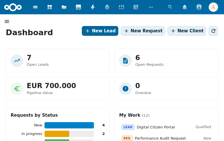
CnStatsBlock
Statistics display card with icon, count, and optional breakdown. Used inside CnKpiGrid.
Wraps: NcLoadingIcon
Try it
Loading CnStatsBlock playground…
Props
| Prop | Type | Default | Description |
|---|---|---|---|
title | String | '' | Card title |
count | Number | 0 | Main count value (formatted with toLocaleString) |
countLabel | String | 'objects' | Unit label below count |
breakdown | Object | null | Key-value pairs for breakdown display |
loading | Boolean | false | Loading state |
loadingLabel | String | 'Loading...' | |
emptyLabel | String | 'No items found' | |
icon | Component | null | MDI icon component |
iconSize | Number | 24 | Icon pixel size |
variant | String | 'default' | 'default', 'primary', 'success', 'warning', 'error' |
horizontal | Boolean | false | Icon-left layout |
clickable | Boolean | false | Enable click interaction |
showZeroCount | Boolean | false | Display 0 as a count value instead of the empty label |
route | Object | null | Vue Router location object ({ name, path, query, ... }). When set, the card renders as a <router-link> and clickable styles are applied automatically. |
Events
| Event | Payload | Description |
|---|---|---|
click | event | Block clicked (only if clickable) |
Slots
| Slot | Bindings | Description |
|---|---|---|
#icon | — | Custom icon content |
#value | count (number), formatted (string) | Override the prominently-displayed value with a pre-formatted string (currency, percent, a — placeholder, …). count stays the raw number — this is presentation only. Defaults to the localized count. When provided, the value area always renders (even at count 0). |
Usage
<CnStatsBlock
  title="Active Contacts"
  :count="150"
  count-label="contacts"
  variant="primary"
  :breakdown="{ 'This week': 12, 'This month': 43 }"
  :icon="AccountGroupOutline"
  :clickable="true"
  @click="navigateToContacts" />
Formatted value via the #value slot
Keep count numeric and format the displayed value in the slot (currency, percent, a — placeholder):
<CnStatsBlock title="Total Pipeline Value" :count="totalValue" count-label="open opportunities">
  <template #value>{{ formatCurrency(totalValue) }}</template>
</CnStatsBlock>

<CnStatsBlock title="Win Rate" :count="winRate ?? 0" count-label="closed deals">
  <template #value>{{ winRate === null ? '—' : Math.round(winRate * 100) + '%' }}</template>
</CnStatsBlock>
Reference (auto-generated)
The tables below are generated from the SFC source via vue-docgen-cli. They reflect what's actually in CnStatsBlock.vue and update automatically whenever the component changes.
Props
| Name | Type | Required | Default | Description |
|---|---|---|---|---|
title | string | '' | Block title | |
count | number | 0 | The main count number to display prominently | |
countLabel | string | () => t('nextcloud-vue', 'objects') | Label displayed next to the count | |
breakdown | object | null | Detailed breakdown object (key-value pairs) | |
loading | boolean | false | Whether data is currently loading | |
loadingLabel | string | () => t('nextcloud-vue', 'Loading...') | Text shown while loading | |
emptyLabel | string | () => t('nextcloud-vue', 'No items found') | Text shown when count is 0 | |
icon | object|func | null | Icon component (e.g., imported MDI icon) | |
iconSize | number | 24 | Icon size in pixels | |
variant | string | 'default' | Color variant: 'default', 'primary', 'success', 'warning', 'error' | |
horizontal | boolean | false | Use horizontal layout (icon left, content right) | |
clickable | boolean | false | Whether the card is clickable | |
showZeroCount | boolean | false | Whether to display 0 as a count value instead of the empty label | |
route | object | null | Vue Router location object for declarative navigation. When set, the card renders as a <router-link> and clickable styles are implied. { name: 'Cases', query: { status: 'open' } } { path: '/catalogi' } |
Events
| Name | Payload | Description |
|---|---|---|
click | — |
Slots
| Name | Bindings | Description |
|---|---|---|
icon | — | |
value | count, formatted | Override the prominently-displayed value — render a pre-formatted string (currency, percent, a "—" placeholder, …). count stays the raw number; this is presentation only. Defaults to the localized count. |