CnIndexSidebar
Schema-driven right sidebar with tabs for search, faceted filters, and column visibility. Typically used alongside CnIndexPage.
Wraps: NcAppSidebar, NcAppSidebarTab, NcTextField, NcSelect, NcCheckboxRadioSwitch, NcPopover. See NcAppSidebar for the underlying primitive.
Try it
Anatomy
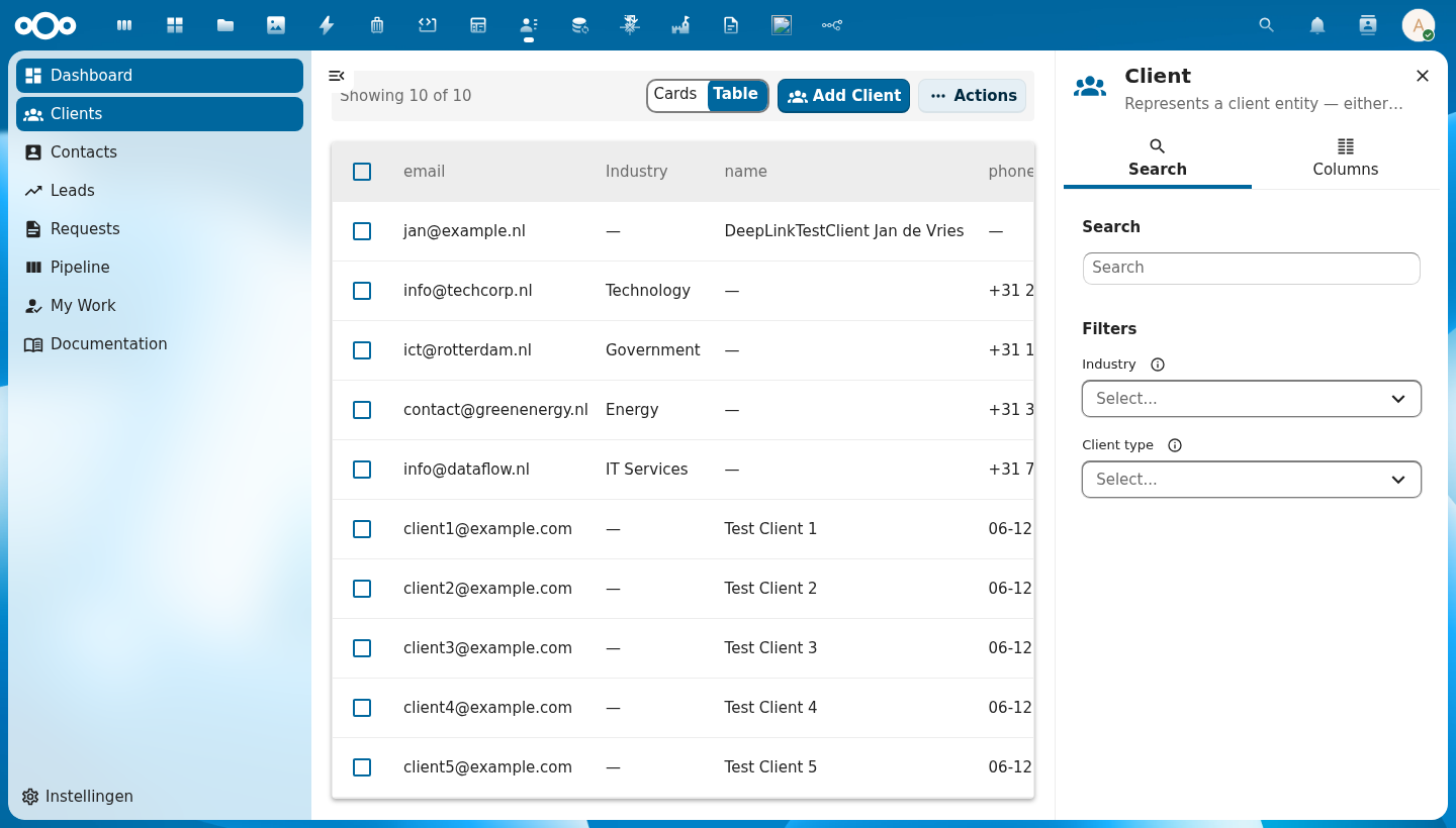
+-------------------------------+
|  [icon]  Entity Title    [×]  |  ← header: schema icon + title + close button
+-------------------------------+
|  [🔍 Search]  [▦ Columns]    |  ← tab bar
+-------------------------------+
|                               |
|  Search                       |
|  [ Type to search...      ]   |  ← full-text search input
|                               |
|  Filters                      |
|  Field A  ⓘ  [Select...  ▾]  |  ← auto-generated from schema.properties
|  Field B  ⓘ  [Select...  ▾]  |    only properties with enum/facetable shown
|                               |
+-------------------------------+

  ── Columns tab ──────────────
|  Column Visibility            |
|  Select which columns to show |
|                               |
|  Properties                   |
|  ☑ name   ☑ email   ☐ phone  |  ← toggle checkboxes
|                               |
|  Metadata                     |
|  ☑ created  ☐ updated        |
+-------------------------------+
| Region | Description |
|---|---|
| Header | Schema icon (via CnIcon), entity title, and a close button that emits update:open |
| Search tab | Full-text search input and faceted filter dropdowns auto-generated from the schema |
| Columns tab | Checkboxes to toggle each column's visibility; grouped by property group and Metadata |
| Filter controls | One control per filterable schema property; shows live counts when facetData is provided |
Usage
<CnIndexSidebar
  :schema="schema"
  :search-value="search"
  :active-filters="filters"
  :facet-data="facets"
  :visible-columns="columns"
  @search="onSearch"
  @filter-change="onFilterChange"
  @columns-change="onColumnsChange" />
When using CnIndexPage, the sidebar is managed internally — you do not need to wire it up separately.
Props
| Prop | Type | Default | Description |
|---|---|---|---|
schema | Object | null | Schema object — drives auto-generated filters (from properties) and the column list |
title | String | '' | Sidebar header title; defaults to schema.title when empty |
icon | String | '' | MDI icon name or emoji shown in the header; defaults to schema.icon |
open | Boolean | true | Controls sidebar open/closed state (use with v-model:open) |
searchValue | String | '' | Current search term (controlled); bind to your store's search state |
searchPlaceholder | String | 'Type to search...' | Placeholder text inside the search input |
activeFilters | Object | {} | Currently active filter values: { fieldName: [selectedValues] } |
facetData | Object | {} | Live facet counts from the backend: { fieldName: { values: [{ value, count }] } } — shows counts next to each filter option |
visibleColumns | Array | null | Array of column keys currently shown in the table; controls the Columns tab checkboxes |
columnGroups | Array | [] | Additional custom column groups to add to the Columns tab |
showMetadata | Boolean | true | When true, includes a built-in "Metadata" group with created, updated, uuid columns |
propertiesGroupLabel | String | '' | Override the label for the auto-generated properties column group |
defaultTab | String | 'search-tab' | ID of the tab that is active when the sidebar opens. Built-in values: 'search-tab', 'columns-tab'. Use your custom tab's id for custom tabs |
searchTabLabel | String | 'Search' | Label for the Search tab button |
columnsTabLabel | String | 'Columns' | Label for the Columns tab button |
searchLabel | String | 'Search' | Heading inside the Search tab |
filtersLabel | String | 'Filters' | Heading above the filter controls |
columnsHeading | String | 'Column Visibility' | Heading inside the Columns tab |
columnsDescription | String | 'Select which columns to display in the table' | Subtitle inside the Columns tab |
userIsAdmin | Boolean | true | Whether the current user is an admin. When false, schema properties with adminOnly: true are hidden from the filter list in the Search tab. |
Events
| Event | Payload | Description |
|---|---|---|
search | searchTerm | Emitted when the search input changes |
filter-change | { key, values } | Emitted when a filter selection changes; values is the updated array of selected values for that key |
columns-change | visibleKeys[] | Emitted when the user toggles a column; payload is the full updated array of visible column keys |
update:open | isOpen | Emitted when the close button is clicked; use with v-model:open |
tab-change | tabId | Emitted when the user switches tabs; payload is the new tab's id string |
Slots
| Slot | Description |
|---|---|
#search-above | Content rendered above the search field in the Search tab (e.g. hints, quick actions). Only the section is rendered when the slot has content. |
#search-extra | Content rendered at the bottom of the Search tab, below the search field and filters |
#columns-extra | Additional content rendered at the bottom of the Columns tab |
#tabs | Inject one or more additional NcAppSidebarTab components after the built-in Search and Columns tabs |
Icon Resolution
The sidebar header displays an icon from the icon prop (or schema.icon). Icons are resolved via the CnIcon registry — make sure your app has called registerIcons() with the required icon components before using this sidebar.
Reference (auto-generated)
The tables below are generated from the SFC source via vue-docgen-cli. They reflect what's actually in CnIndexSidebar.vue and update automatically whenever the component changes.
Props
| Name | Type | Required | Default | Description |
|---|---|---|---|---|
title | string | '' | Sidebar title. Defaults to schema.title when not set. | |
icon | string | '' | MDI icon name or emoji. Defaults to schema.icon when not set. | |
schema | object | null | Schema object for auto-generating filters, columns, and labels | |
visibleColumns | array | null | Array of currently visible column keys | |
searchValue | string | '' | Current search term | |
open | boolean | true | Whether sidebar is open | |
activeFilters | object | \{\} | Current active facet filters: { fieldName: [values] } | |
facetData | object | \{\} | Live facet data from API: { fieldName: { values: [{value, count}] } } | |
columnGroups | array | [] | Additional column groups beyond schema properties and the built-in Metadata. Each group: { id: string, label: string, columns: Array<{key, label}>, expanded?: boolean } | |
showMetadata | boolean | true | Whether to include the built-in Metadata column group | |
searchPlaceholder | string | () => t('nextcloud-vue', 'Type to search...') | Search input placeholder | |
searchTabLabel | string | () => t('nextcloud-vue', 'Search') | Search tab label | |
columnsTabLabel | string | () => t('nextcloud-vue', 'Columns') | Columns tab label | |
searchLabel | string | () => t('nextcloud-vue', 'Search') | Search section heading | |
filtersLabel | string | () => t('nextcloud-vue', 'Filters') | Filters section heading | |
columnsHeading | string | () => t('nextcloud-vue', 'Column visibility') | Columns section heading | |
columnsDescription | string | () => t('nextcloud-vue', 'Select which columns to display in the table') | Columns section description | |
propertiesGroupLabel | string | '' | Override label for the schema properties group. Defaults to schema.title. | |
defaultTab | string | 'search-tab' | ID of the tab that should be active when the sidebar opens. Built-in IDs are 'search-tab' and 'columns-tab'. Use the id you set on your custom NcAppSidebarTab for custom tabs. | |
userIsAdmin | boolean | true | Whether the current user is an admin. When false, schema properties with adminOnly: true are hidden from filters. |
Events
| Name | Payload | Description |
|---|---|---|
update:open | — | |
search | — | |
tab-change | — | |
columns-change | — | |
filter-change | — |
Slots
| Name | Bindings | Description |
|---|---|---|
search-above | — | |
search-extra | — | |
columns-extra | — | |
tabs | — |