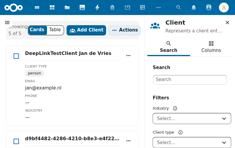
CnCardGrid
Responsive CSS grid layout for CnObjectCard instances. Auto-fills with minmax(320px, 1fr).
Wraps: NcLoadingIcon, NcEmptyContent, CnObjectCard
Try it
Loading CnCardGrid playground…
Props
| Prop | Type | Default | Description |
|---|---|---|---|
objects | Array | [] | Object data array |
schema | Object | null | Passed to each CnObjectCard (required only when using the default card template; not needed when providing a custom #card slot) |
loading | Boolean | false | Loading state |
selectable | Boolean | false | Enable card selection |
selectedIds | Array | [] | Currently selected IDs |
rowKey | String | 'id' | Unique identifier field |
emptyText | String | 'No items found' |
Events
| Event | Payload | Description |
|---|---|---|
click | object | Card clicked |
select | ids[] | Selection changed |
Slots
| Slot | Scope | Description |
|---|---|---|
#card | \{ object, selected, schema \} | Custom card template |
#card-actions | \{ object \} | Card action buttons |
#card-badges | \{ object \} | Card badges |
#empty | — | Custom empty state |
Usage
<CnCardGrid
  :objects="contacts"
  :schema="schema"
  :selectable="true"
  :selected-ids="selected"
  @click="onCardClick"
  @select="onSelect" />
Reference (auto-generated)
The tables below are generated from the SFC source via vue-docgen-cli. They reflect what's actually in CnCardGrid.vue and update automatically whenever the component changes.
Props
| Name | Type | Required | Default | Description |
|---|---|---|---|---|
objects | array | [] | Array of objects to display as cards | |
schema | object | null | Schema definition (passed through to CnObjectCard) | |
loading | boolean | false | Whether data is loading | |
selectable | boolean | false | Whether cards can be selected | |
selectedIds | array | [] | Array of currently selected object IDs | |
rowKey | string | 'id' | Property name used as unique identifier | |
emptyText | string | () => t('nextcloud-vue', 'No items found') | Text shown when there are no objects |
Events
| Name | Payload | Description |
|---|---|---|
click | — | |
select | — |
Slots
| Name | Bindings | Description |
|---|---|---|
empty | — | |
card | object, selected, schema | |
card-actions | object | |
card-badges | object |