CnVersionInfoCard
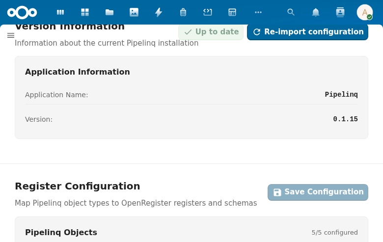
Displays application version information in admin settings pages. Shows the app name, installed version, optional configured version, and an update status indicator with an optional update button.
Try it
Loading CnVersionInfoCard playground…
Props
| Prop | Type | Default | Description |
|---|---|---|---|
appName | String | (required) | Application name displayed in the version row |
appVersion | String | (required) | Installed application version string |
title | String | 'Version information' | Section title |
description | String | 'Information about the current application installation' | Section description |
docUrl | String | '' | Documentation URL — shows an info icon link next to the title |
cardTitle | String | 'Application information' | Heading shown inside the card |
configuredVersion | String | '' | Configured version string (for apps that track configuration versions separately). When non-empty, an extra row is shown. |
isUpToDate | Boolean | true | Whether the configured version matches the installed version. Controls the status indicator color. |
showUpdateButton | Boolean | false | Whether to show an "Update" action button |
updating | Boolean | false | Whether an update is currently in progress (shows a loading indicator on the button) |
additionalItems | Array | [] | Extra key-value items: [{ label, value, statusClass? }] |
loading | Boolean | false | Loading state |
labels | Object | { appName: 'Application Name', version: 'Version', configuredVersion: 'Configured Version' } | Override the standard row labels |
Events
| Event | Payload | Description |
|---|---|---|
update | — | Emitted when the Update button is clicked |
Slots
| Slot | Description |
|---|---|
#actions | Extra action buttons in the card header |
#additional-items | Custom additional items (replaces additionalItems prop rendering) |
#footer | Footer content below the card |
#extra-cards | Additional cards rendered after the version info card |
Usage
<CnVersionInfoCard
  app-name="OpenRegister"
  app-version="1.5.0"
  configured-version="1.4.0"
  :is-up-to-date="false"
  :show-update-button="true"
  :updating="updating"
  @update="runUpdate" />
Reference (auto-generated)
The tables below are generated from the SFC source via vue-docgen-cli. They reflect what's actually in CnVersionInfoCard.vue and update automatically whenever the component changes.
Props
| Name | Type | Required | Default | Description |
|---|---|---|---|---|
title | string | () => t('nextcloud-vue', 'Version information') | Section title | |
description | string | () => t('nextcloud-vue', 'Information about the current application installation') | Section description | |
docUrl | string | '' | Documentation URL (shows info icon next to title) | |
cardTitle | string | () => t('nextcloud-vue', 'Application information') | Card heading text | |
appName | string | ✓ | — | Application name to display |
appVersion | string | ✓ | — | Application version string |
configuredVersion | string | '' | Configured version (optional, for apps that track configuration versions separately) | |
isUpToDate | boolean | true | Whether the app configuration is up to date | |
showUpdateButton | boolean | false | Whether to show the update button | |
updating | boolean | false | Whether an update is currently in progress | |
additionalItems | array | [] | Additional key-value items to display. Format: [{ label: 'Label', value: 'Value', statusClass: 'cn-version-info__status--ok' }] | |
loading | boolean | false | Whether version info is loading | |
labels | object | \{ appName: 'Application Name', version: 'Version', configuredVersion: 'Configured Version' \} | Custom labels for the standard fields |
Events
| Name | Payload | Description |
|---|---|---|
update | — |
Slots
| Name | Bindings | Description |
|---|---|---|
actions | — | |
additional-items | — | |
footer | — | |
extra-cards | — |