CnFormDialog
Schema-driven create/edit form dialog. Auto-generates form fields from a schema, supports multiple widget types, and follows the two-phase confirm/result pattern.
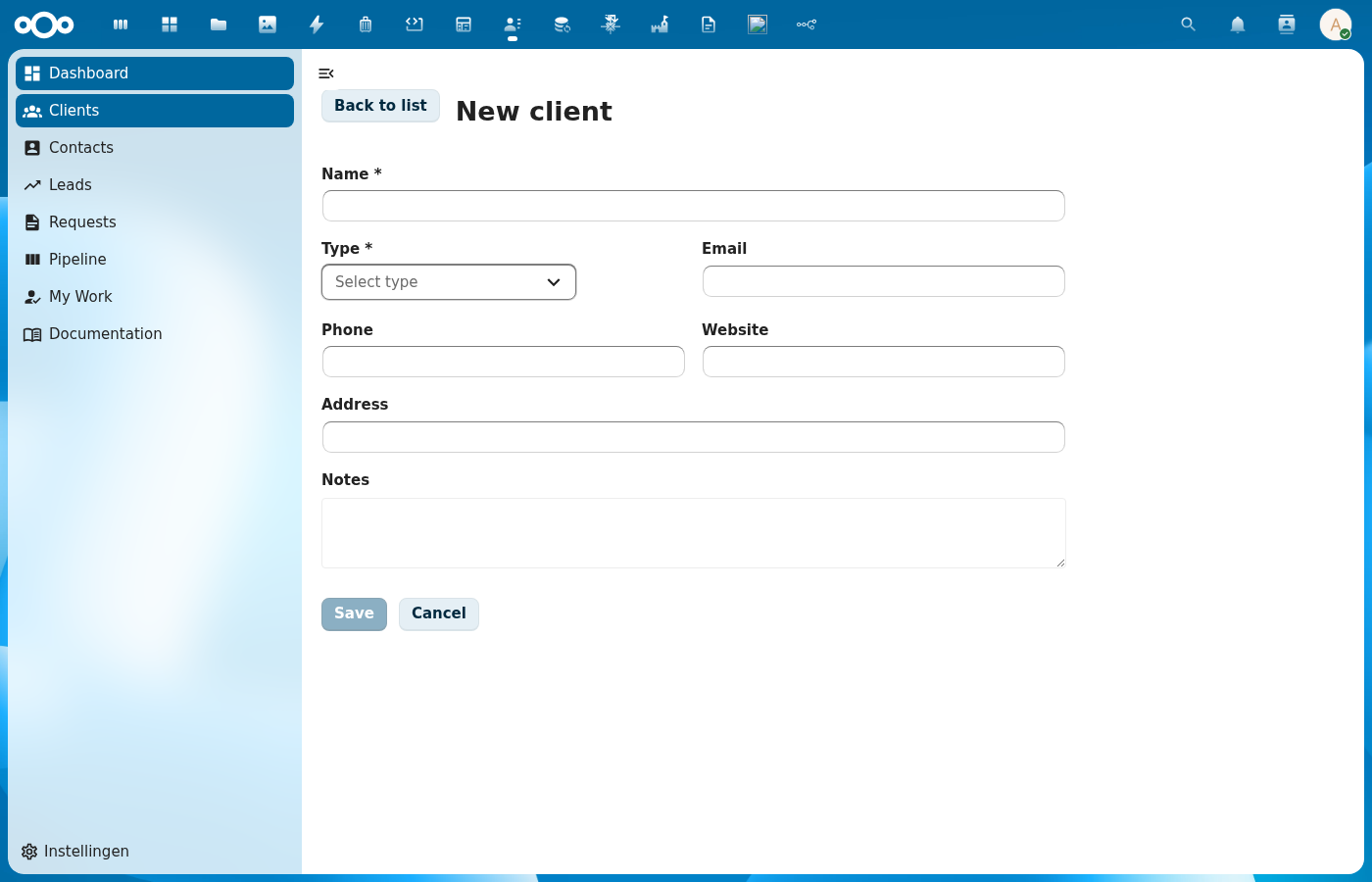
Try it
Wraps: NcDialog, NcButton, NcTextField, NcSelect, NcCheckboxRadioSwitch
Props
| Prop | Type | Default | Description |
|---|---|---|---|
schema | Object | null | Schema for auto-generating fields |
item | Object | null | For edit mode (null = create) |
register | String | '' | Register slug used to resolve OpenRegister object references ($ref). A schema property that is an object reference renders as a searchable dropdown of the referenced objects (label = human name, value = UUID). See Object references. When empty, reference fields fall back to a plain text input. |
dialogTitle | String | '' | Defaults to "Create/Edit {schema.title}" |
fields | Array | null | Manual field definitions (overrides schema) |
excludeFields | Array | [] | Fields to hide |
includeFields | Array | null | Fields to show (whitelist) |
fieldOverrides | Object | {} | Per-field overrides (see Field Overrides) |
nameField | String | 'title' | |
size | String | 'normal' | Dialog size |
successText | String | '' | |
cancelLabel | String | ||
closeLabel | String | ||
confirmLabel | String | ||
referenceContext (reference-context) | Object | null | null | Object context { register, schema, objectId } forwarded to the integration single-entity widget rendered for fields that declare a referenceType (AD-18). Optional. |
Widget Types
| Widget | Used For |
|---|---|
text | Short strings |
email | Email addresses |
url | URLs |
number | Numeric input |
textarea | Long text |
select | Single choice from options (static or async) |
multiselect | Multiple choices (static or async) |
tags | Tag input (with optional async suggestions) |
checkbox | Boolean toggle |
date | Date picker |
datetime | Date-time picker |
json | JSON editor (CnJsonViewer). formData holds the parsed value; invalid JSON blocks confirm |
code | Freeform code editor (CnJsonViewer). formData holds the raw string; syntax highlighting via field.language |
Events
| Event | Payload | Description |
|---|---|---|
confirm | formData | Form confirmed (includes id when editing) |
close | — | Dialog closed |
Slots
| Slot | Scope | Description |
|---|---|---|
#form | fields, formData, errors, updateField | Full form override |
#field-\{key\} | field, value, error, updateField | Per-field override |
#field-\{key\}-option | option object properties | Custom dropdown option rendering for a select/multiselect/tags field |
#field-\{key\}-selected-option | option object properties | Custom selected option display for a select/multiselect/tags field |
#before-fields | — | Content before fields |
#after-fields | — | Content after fields |
The #field-{key}-option and #field-{key}-selected-option slots receive all properties of the option object as scope. They are forwarded directly to NcSelect's #option and #selected-option slots. When not provided, NcSelect uses its default label-based rendering.
Public Methods
| Method | Description |
|---|---|
validate() | Client-side validation (returns boolean) |
setResult(result) | Set the terminal operation result ({ success?, error? }). Switches to the result phase, replacing the form. |
setValidationErrors(fieldErrors, message?) | Show server validation errors without leaving the form phase so the user can fix the data. fieldErrors maps field key → message; the optional message is shown as a form-level error note above the fields. Use this for 400/422 responses instead of setResult({ error }). |
Field Definition
When using the fields prop (manual field definitions), each field object supports:
| Property | Type | Description |
|---|---|---|
key | String | Required. Form data key and slot name suffix |
label | String | Required. Display label |
widget | String | Required. Widget type (see table above) |
required | Boolean | Marks field as required |
readOnly | Boolean | Disables the field |
description | String | Helper text shown below the field |
default | * | Default value for create mode |
enum | Array | Function | Options for select widget. Static array or async function (see below) |
items | Object | For multiselect: { enum: [...] } or { enum: asyncFn } |
debounce | Number | Debounce delay in ms for async enum search (default: 300) |
validation | Object | { minLength, maxLength, minimum, maximum, pattern } |
language | String | For code: 'json' | 'xml' | 'html' | 'text' | 'auto' (default 'auto') |
JSON and code fields
For structured-data editing, use widget: 'json'; for freeform highlighted code, use widget: 'code'. Both render a CnJsonViewer inline.
widget: 'json'
Use when the schema property holds a structured value (object, array, primitive, or null). fieldsFromSchema skips type: 'object' by default — setting an explicit widget opts the property back in, so object-shaped values flow through.
// schema
{
  title: 'Consumer',
  required: ['name'],
  properties: {
    name: { type: 'string', title: 'Name', required: true },
    authorizationConfiguration: {
      type: 'object',
      widget: 'json',
      title: 'Authorization configuration',
    },
  },
}
The editor shows pretty-printed JSON. On every keystroke the content is parsed: on success formData.authorizationConfiguration updates to the parsed value; on failure the previous value is preserved, an inline error appears, and the Confirm button is disabled until the JSON is valid. An empty editor resolves to null.
widget: 'code'
Stores the raw string as-is — no parse, no validation.
{
  type: 'string',
  widget: 'code',
  title: 'Template',
  language: 'html',
}
language may be 'json', 'xml', 'html', 'text', or 'auto' (default 'auto' — CnJsonViewer sniffs the content).
Async Select
Select, multiselect, and tags fields support async options by setting enum (or items.enum) to an async function instead of a static array:
{
  key: 'organisation',
  widget: 'select',
  label: 'Organisation',
  required: true,
  description: 'Type to search for organisations',
  enum: async (query) => {
    const results = await orgStore.search(query, 20, 0)
    return results.map(org => ({
      label: org.name,
      id: org.uuid,
      description: org.description,
      users: org.users,
    }))
  },
  debounce: 500,
}
Behavior:
- The function receives the search query string and must return an array of option objects
- Each option must have a
labelproperty (used by NcSelect for default display) - Options are loaded on mount (called with
'') and on each search input (debounced) - Per-field loading state is shown via NcSelect's loading indicator
filterableis automatically set tofalsefor async fields (server-side filtering)- Async selects store the full option object in
formData(not just an ID)
Static enums are unchanged — arrays work exactly as before, storing just the ID value.
Object references ($ref)
A schema property that is an OpenRegister object reference renders as a searchable dropdown of the referenced objects (label = human name, value = UUID) instead of a free-text UUID box:
// schema
{
  title: 'Case',
  required: ['title', 'caseType'],
  properties: {
    title: { type: 'string', title: 'Title' },
    // single reference → searchable single-select
    caseType: { type: 'string', format: 'uuid', $ref: 'caseType', title: 'Case type' },
    // array of references → searchable multi-select
    contacts: { type: 'array', items: { $ref: 'contact' }, title: 'Contacts' },
  },
}
<CnFormDialog :schema="schema" :register="'zaken'" @confirm="onConfirm" />
Behavior:
fieldsFromSchemaresolves a$refproperty to aselectwidget (ormultiselectforitems.$ref) and recordsfield.reference = { schema, multiple }. The$refvalue is the referenced schema slug.- Pass the
registerprop so the dialog can fetch the referenced objects viaGET /api/objects/{register}/{schema}(limit 100, server-filtered by the search term). - Each object is mapped to
{ label, value }where the label resolves throughtitle → name → naam → label → identifier → @self.name → id. - The value stored in
formDatais the UUID (single) or array of UUIDs (multiple) — never the full object. In edit mode the stored UUID is resolved to its label so the current selection displays. - When
registeris empty (or the fetch fails) the field falls back to a plain text input — no regression, no console spew.
CnIndexPage threads its own register into the built-in CnFormDialog automatically, so reference fields resolve out of the box on manifest-driven and self-fetch pages.
Field Overrides
The fieldOverrides prop accepts an object keyed by field name. Each override is merged onto the auto-generated field definition, so any field property can be changed.
enumLabels
For select fields backed by an enum, the dropdown displays raw enum values by default. Use enumLabels to provide human-readable labels:
fieldOverrides: {
  type: {
    enumLabels: { internal: 'Internal', mongodb: 'MongoDB' },
  },
}
The enumLabels object maps each enum value to its display label. Values without a mapping fall back to the raw value.
Live demo
<template>
  <div>
    <button @click="open = true" style="padding: 6px 16px; border-radius: 4px; background: var(--color-primary-element); color: white; border: none; cursor: pointer;">New contact</button>
    <CnFormDialog
      v-if="open"
      ref="dlg"
      dialog-title="New contact"
      :fields="fields"
      @confirm="onConfirm"
      @close="open = false" />
  </div>
</template>
<script>
export default {
  data() {
    return {
      open: false,
      fields: [
        { key: 'name', label: 'Name', widget: 'text', required: true },
        { key: 'email', label: 'Email', widget: 'email' },
        { key: 'notes', label: 'Notes', widget: 'textarea' },
      ],
    }
  },
  methods: {
    async onConfirm(formData) {
      await new Promise(r => setTimeout(r, 800))
      this.$refs.dlg.setResult({ success: true })
    },
  },
}
</script>
Usage
Basic (schema-driven)
<CnFormDialog
  :schema="schema"
  :item="editItem"
  :exclude-fields="['id', 'created', 'updated']"
  @confirm="onFormConfirm"
  @close="editItem = null">
  <!-- Custom field for 'notes' -->
  <template #field-notes="{ field, value, updateField }">
    <RichTextEditor :value="value" @input="updateField('notes', $event)" />
  </template>
</CnFormDialog>
Async select with custom option rendering
<CnFormDialog
  :fields="fields"
  dialog-title="Add User to Organisation"
  confirm-label="Add User"
  @confirm="onConfirm"
  @close="onClose">
  <!-- Rich dropdown options for organisation -->
  <template #field-organisation-option="{ name, description, users, isDefault }">
    <div class="org-option">
      <div>
        <strong>{{ name }}</strong>
        <span v-if="isDefault" class="badge">Default</span>
      </div>
      <p v-if="description">{{ description }}</p>
      <span class="meta">{{ users?.length || 0 }} members</span>
    </div>
  </template>

  <!-- Simpler display for the selected value -->
  <template #field-organisation-selected-option="{ name }">
    <span>{{ name }}</span>
  </template>

  <!-- Info note below the form -->
  <template #after-fields>
    <NcNoteCard type="info">
      Select an organisation to add the user as a member.
    </NcNoteCard>
  </template>
</CnFormDialog>
// In setup / data:
const fields = [
  {
    key: 'organisation',
    widget: 'select',
    label: 'Organisation',
    required: true,
    enum: async (query) => {
      const results = await orgStore.search(query, 20, 0)
      return results.map(org => ({ label: org.name, id: org.uuid, ...org }))
    },
    debounce: 500,
  },
  {
    key: 'user',
    widget: 'select',
    label: 'User',
    enum: async (query) => {
      const users = await userApi.search(query)
      return users.map(u => ({ label: u.displayName, id: u.id }))
    },
  },
]
Reference (auto-generated)
The tables below are generated from the SFC source via vue-docgen-cli. They reflect what's actually in CnFormDialog.vue and update automatically whenever the component changes.
Props
| Name | Type | Required | Default | Description |
|---|---|---|---|---|
schema | object | null | Schema for auto-generating fields. Either schema or fields must be provided. | |
item | object | null | Existing item for edit mode. Pass null for create mode. | |
register | string | '' | Register slug to resolve OpenRegister object references against. A schema property that is an object reference ($ref: '<schema-slug>', or items.$ref for an array) renders as a searchable dropdown of the referenced objects (label = human name, value = UUID) instead of a free-text UUID box. The $ref value is the referenced schema slug; this prop supplies the register the objects live in. When empty, reference fields fall back to a plain text input (no fetch attempted). | |
dialogTitle | string | '' | Dialog title. Defaults to "Create {schema.title}" or "Edit {schema.title}". | |
fields | array | null | Manual field definitions. Overrides schema-generated fields when provided. | |
excludeFields | array | [] | Field keys to exclude from auto-generated form | |
includeFields | array | null | Field keys to include (whitelist mode) | |
fieldOverrides | object | \{\} | Per-field overrides passed to fieldsFromSchema | |
referenceContext | union | null | Object context forwarded to integration single-entity widgets rendered for fields that declare a referenceType (AD-18): { register, schema, objectId }. Optional. | |
nameField | string | 'title' | Which field is the "name" (used in result messages) | |
size | string | 'normal' | NcDialog size | |
successText | string | '' | Success message. Defaults to "Item saved successfully." | |
cancelLabel | string | () => t('nextcloud-vue', 'Cancel') | Label for the cancel button | |
closeLabel | string | () => t('nextcloud-vue', 'Close') | Label for the close button | |
confirmLabel | string | '' | Confirm button label. Defaults to "Create" or "Save". |
Events
| Name | Payload | Description |
|---|---|---|
close | — | |
confirm | — | Emitted when the user confirms the form. Payload: form data object. Includes id when editing. |
Slots
| Name | Bindings | Description |
|---|---|---|
form | fields, form-data, errors, update-field | |
before-fields | — | |
'field-' + field.key | name, field, value, error, update-field | |
'field-' + field.key + '-option' | name | |
'field-' + field.key + '-selected-option' | name | |
after-fields | — |
Methods
| Name | Description |
|---|---|
validate | Run client-side validation on all form fields. Checks required, minLength, maxLength, pattern, minimum, maximum. |
setResult | Set the result of the save operation. Call this from the parent after the API call completes. |
setValidationErrors | Set validation errors from the server WITHOUT leaving the form phase, so the user can correct the data. Call this from the parent (instead of setResult) when the API returns a validation error. |