Layouts
@conduction/nextcloud-vue provides three pre-composed page layouts. Each is built from Nextcloud's layout primitives — your app selects the appropriate layout per route.
The Default App Shell
Every Nextcloud app starts with the same shell: a top header bar, an app navigation sidebar on the left, and a content area to the right. The library builds all its layouts inside this shell.
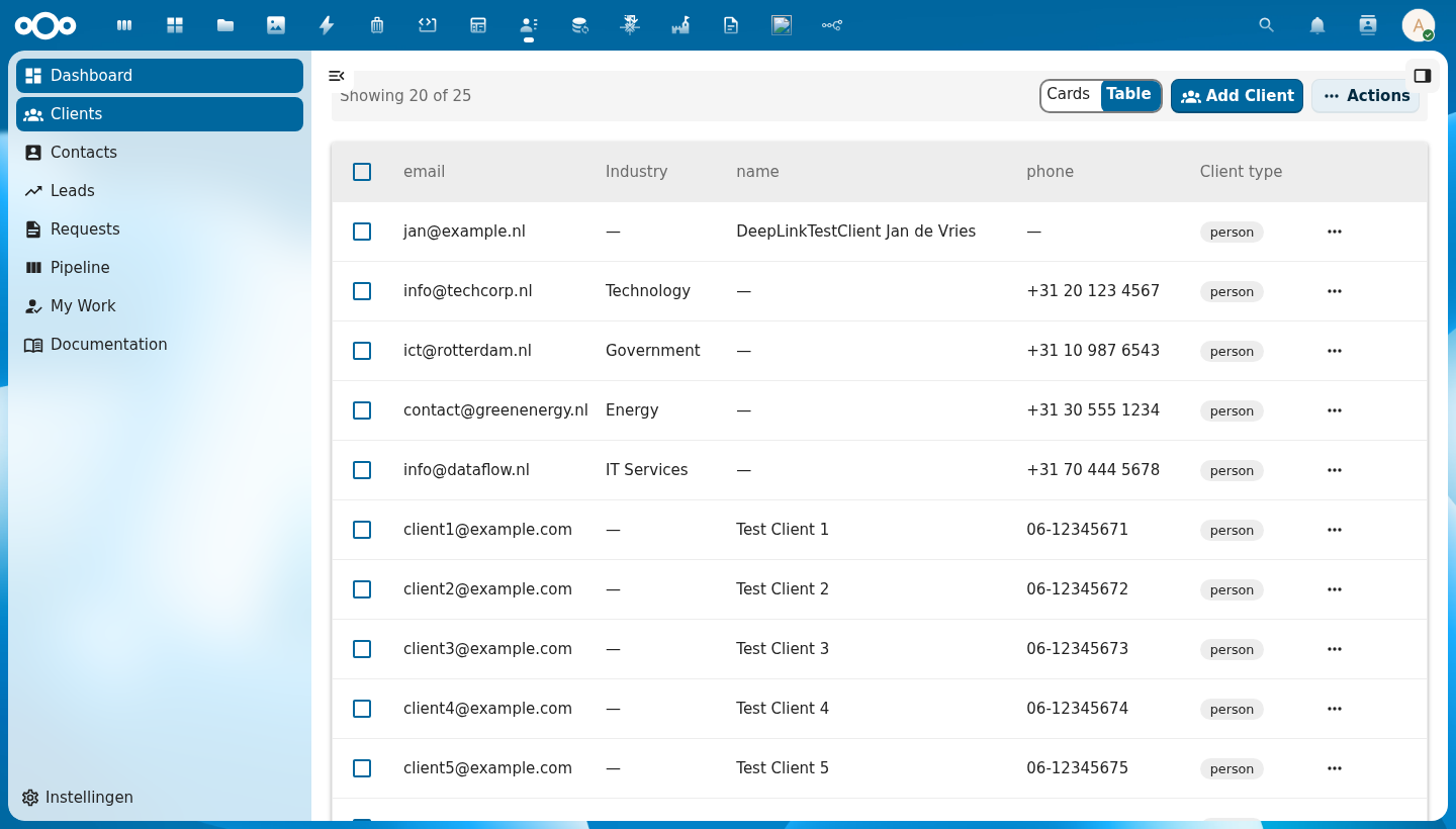
The shell has four regions:
| Region | Nextcloud Primitive | Description |
|---|---|---|
| Header | (global) | Nextcloud top bar — app switcher, search, notifications, user menu |
| App Navigation | NcAppNavigation | Left sidebar — schema icons, entity links, settings link |
| Content | NcAppContent | Main content area — list, detail, or settings view |
| App Sidebar | NcAppSidebar | Right panel — search, filters, column visibility, or object details |
The App Sidebar is optional and can be toggled by the user.
Available Layouts
| Layout | Used For | Key Components |
|---|---|---|
| List Page | Entity list views | CnIndexPage, CnIndexSidebar, CnFacetSidebar |
| Detail Page | Single object view | CnObjectCard, CnFormDialog, CnDeleteDialog |
| Settings Page | Admin configuration | CnSettingsSection, CnRegisterMapping, CnVersionInfoCard |
Navigation
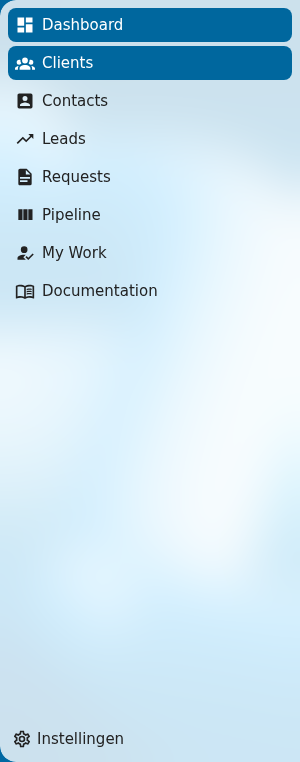
App navigation is app-specific and not wrapped by the library. Apps implement their own MainMenu.vue using Nextcloud's NcAppNavigation. See Nextcloud Layout Components for the full API.